
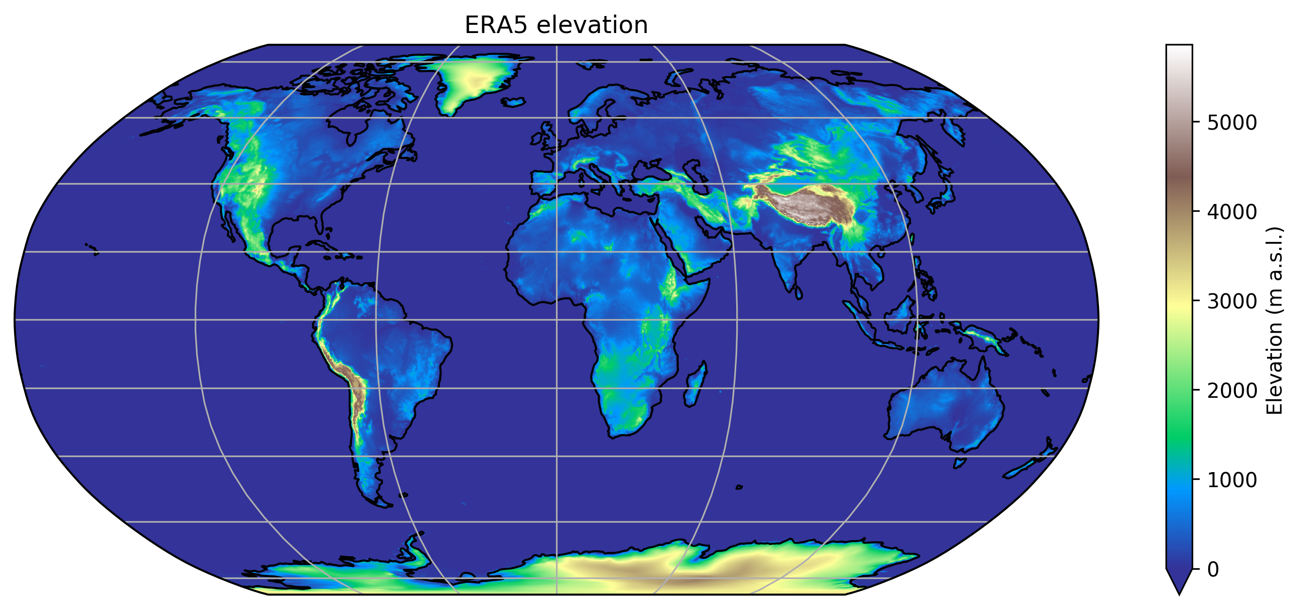
ERA5 is the latest evolution of atmospheric reanalysis products. It makes a huge step forward in terms of data quality and spatial resolution. Here is a map of the topography used by ERA5 (at 0.25°, approx 25km):
 Click on the images to navigate and zoom
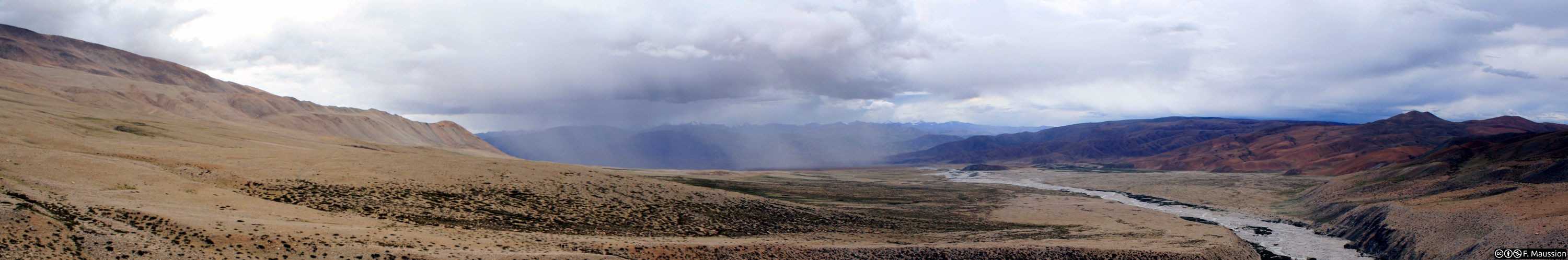
This level of detail is unprecedented for a dataset of this type: a perfect playground for endless data wrangling shenanigans! Today, we have a look at temperature trends at mountain glacier locations in the ERA5 dataset. By “mountain glaciers”, I mean all glaciers except the Greenland and Antarctic ice sheets (data source: RGI).
Important note: this is not peer-reviewed work. Code and data are available (links in the last section of this post), but this work has not undergone thorough quality check by other scientists.
Glaciers are likely to be found at locations warming faster than the rest of the world
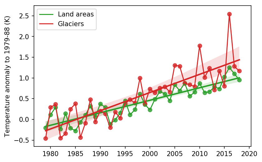
This plot shows the 40 years temperature change with respect to the decade 1979-1988:
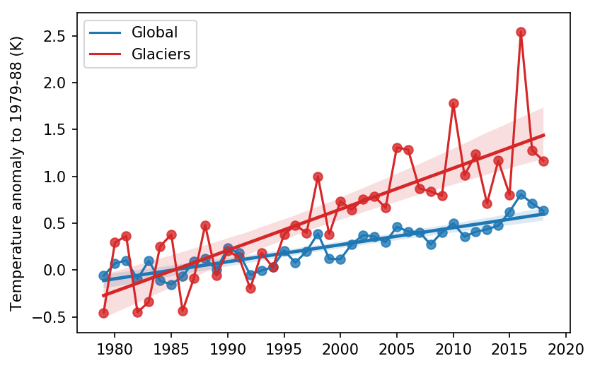
The temperature change at glacier locations (weighted per area, meaning that locations with more glaciers have more weight in the timeseries) is stronger than the average of almost a factor 31.
So the question is: why?
Why?
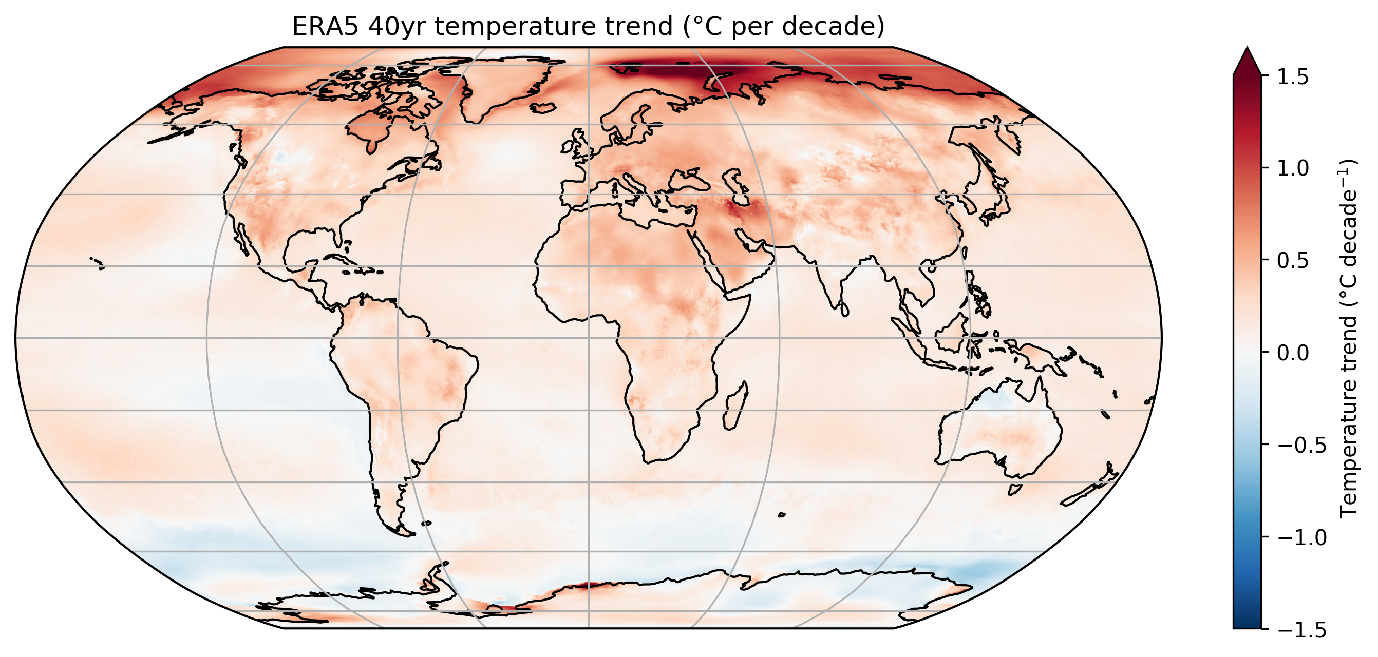
The best way to have a look at this question is to have a look at temperature trends everywhere on Earth, and then at glacier locations in particular.
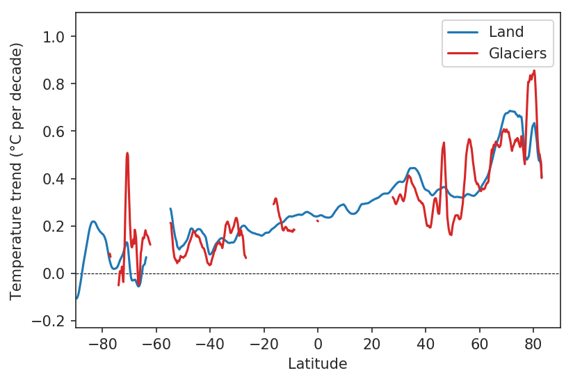
This plot shows the computed trends at each grid point, in units of °C per decade:
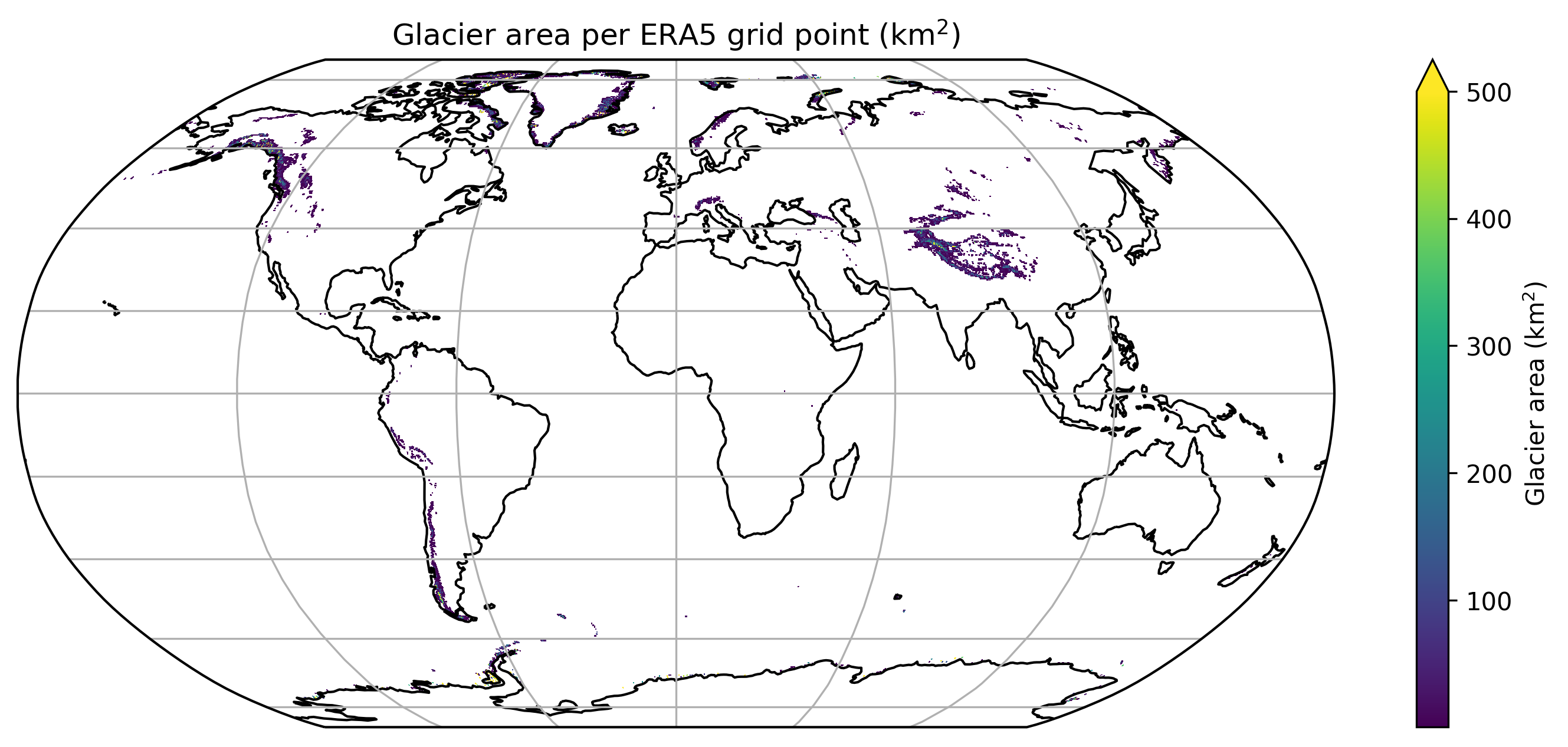
And this map shows where glaciers are located (source: RGI):
So, what do we learn from that?
First, warming above land areas is stronger than above oceans (on average)
This has nothing to do with glaciers: oceans have a huge thermal capacity, and the heat stored at the surface is transported via currents and mixed towards the depths. If we do the same analyses as above but now over land areas only, the picture is more nuanced:
The warming is still more pronounced at glacier locations than on land area, but “only” of a factor 1.5.
Second, warming is stronger at high northern latitudes
This is called “polar amplification”. A good way to look at this is to have a look at the “zonal average”, the temperature trends averaged over each latitude band (here smoothed a little bit for readability):
 Note that there is no data at latitudes where there are no glaciers or no land areas
While most of the tropics and sub-tropics have an average warming of about 0.2°C per decade, the warming goes up to more than 0.5°C at high latitudes (very visible on the map above as well).
And since the majority of ice area tends to be located at high latitudes, this will move the global average towards warmer temperature as well. Here is a plot of the glacier area (in % of the total area) as a function of latitude:
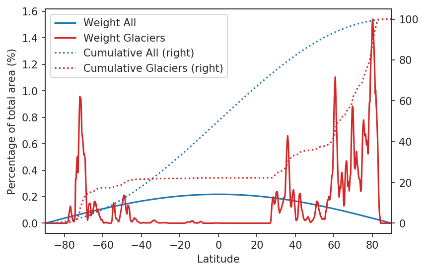
I other words: 50% of the worlds mountain glaciers area is located north of 63°N, although this region represents only about 5% of the Earth’s surface.
Third: is there an elevation dependent warming?
Elevation dependent warming is also a thing, but it is more controversial. However, it is worth mentioning that there seems to be indications of elevation dependent warming in the ERA5 dataset. Let’s have a look at the warming at all locations above 1000 m a.s.l.2, again as a function of latitude:
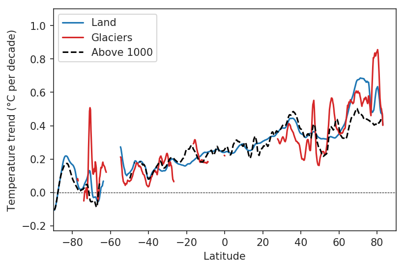
This shows us a more complex picture, but a few things come to mind (see also the interactive map below where you can zoom):
- the glacier curve follows the “above 1000” curve quite closely at lower latitudes, not too surprisingly
- the warming signal is quite strong in the European Alps (50°N) and in Alaska (60°N)
- the signal in High Mountain Asia is visible on the map, but not on the zonal averages because of strong warming elsewhere at the same latitude
Interactive map (scroll for zoom, use your mouse for pan and hover):
A number of questions remain
- the analyses above are quite simplistic and qualitative, and would require a more in-depth analysis - maybe one of our master or grad student wants to tackle this?
- importantly: if there is an elevation dependent warming in ERA5, what are the
processes at play? The newly released ERA5-land dataset might help to
understand what is going on. - if this warming is real - how can we validate it? Mountain areas are notoriously sparse in weather stations, and ERA5 still is a modelled product (using a clever model, but still…)
These questions are left for the reader to answer! I’m happy to help if you want to tackle these.
Data and methods
The WIP code can be found here.
Data and methods, in short:
- ERA5 is available on a global 0.25° grid, 1979-present
- when computing the global average, we do correct for spherical earth (area weighted average). We also recompute our weights for land and ocean areas
- when computing the global glacier average for glaciated areas, we weight for the total glacier area per grid point
- glaciated areas are obtained from the RGI version 6
- for the trend computations we do nothing fancy: just a linear regression, no statistical significance test. Standard Errors are indicated in the interactive map above
- for the zonal plots, we smooth with a moving average window of 5 grid points
Analyses powered by xarray, pandas, matplotlib, and the HoloViz ecosytem.
A cautionary note about ERA5: although an awesome dataset and a tremendous effort, ERA5 data needs to be taken with caution. It is the outcome of the merging of observations and modelling (data assimilation), which does not exempt issues with data homogeneity in space and time, and is not free of uncertainties (especially in mountain regions).