

I had to review two manuscripts this week (a student’s thesis and a manuscript submitted to an established journal). By coincidence, both made use of a kind of plot I did encounter before, but not in the context of trend analysis: I’ll call it the “triangle plot”, even if I think that it must also have a more official name.
These plots are quite handy since they allow to show the temporal evolution of the trend of a timeseries, and this for various time windows. You can see an example here, and a variant of it has been used to demonstrate the statistical weakness of the arguments supporting the so-called warming “pause”.
Here I just wanted to highlight a very basic (and dangerous) feature of these plots: by increasing the number of trials, they automatically increase the chance to find “statistically significant” trends in any timeseries.
Note: the code used to produce the plots below is available here.
Real data case: global temperature anomalies
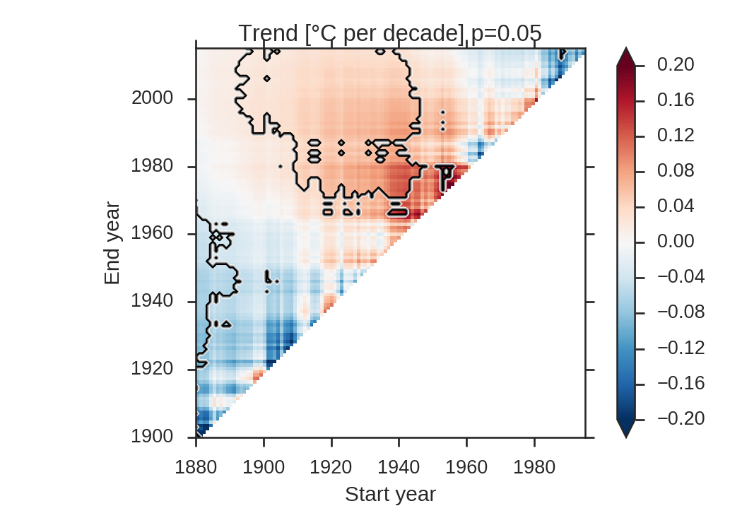
Let’s start from the well-known and freely available GISTEMP global temperature timeseries:
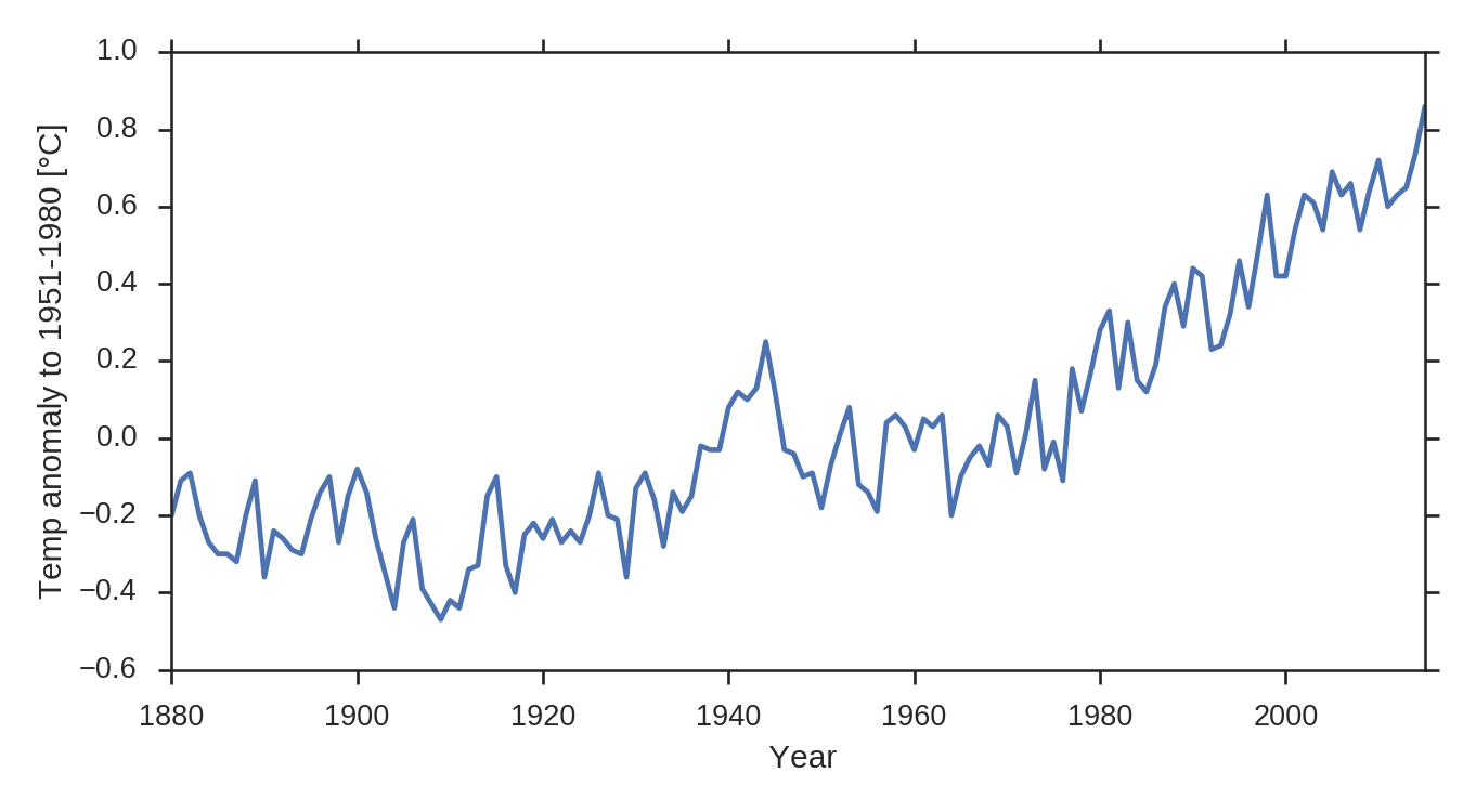
Shown are the yearly anomalies to the period 1951-1980. Let’s apply a simple trend analysis based on linear regression. We limit the size of the window to a minimum of 20 years. The contours mark the p=.05 significance level obtained with a two-sided student’s t-test (real-world trend analysis would require more careful statistical processing, but for the purpose of this post we keep it simple):
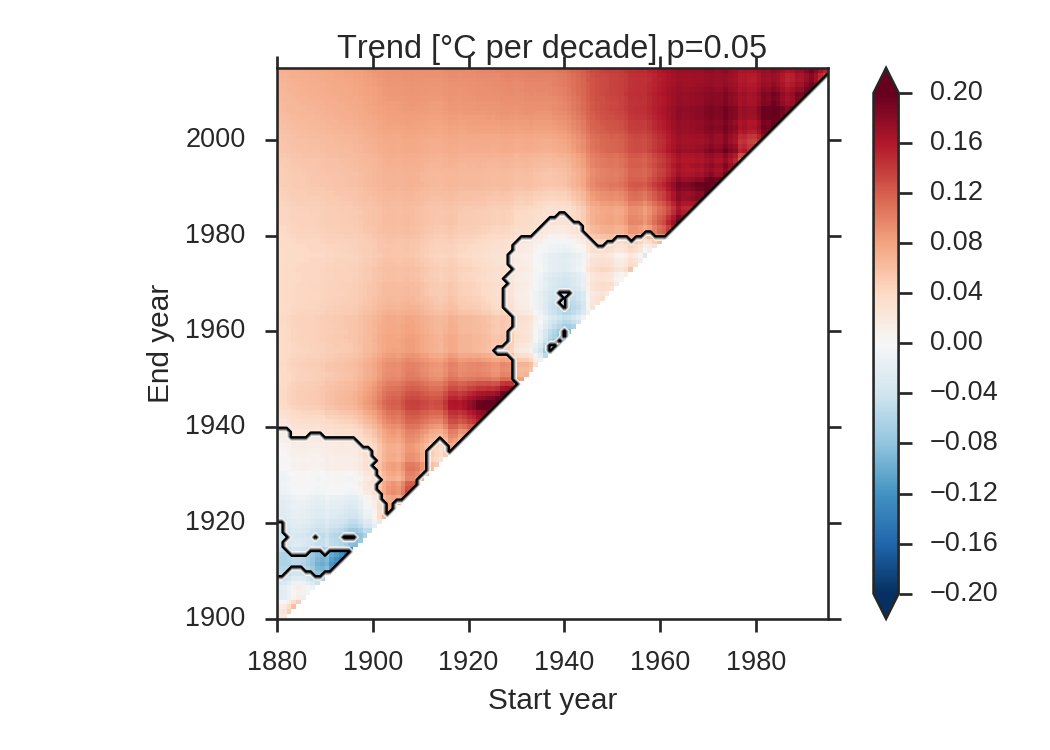
The plateaus (at the begining of the century and between the 40s and the 60s) are clearly visible. 84% of the plotted trends are significant, and particularly strong since the 60s.
Random case
We now create a timeseries of the same length as the GISTEMP dataset, with the same standard deviation (we assume normality, which is not really true for this dataset).
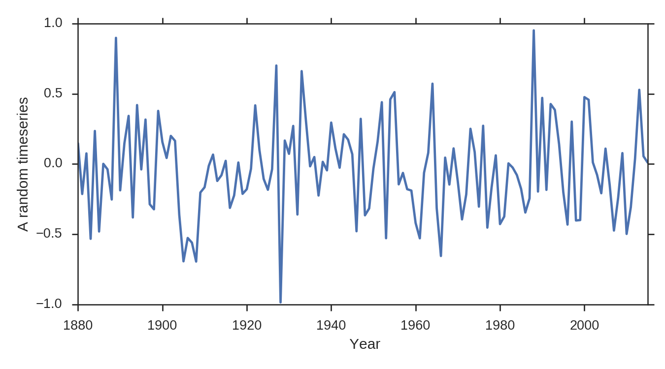
We apply the same analysis procedure to this fake timeseries and obtain the following plot:
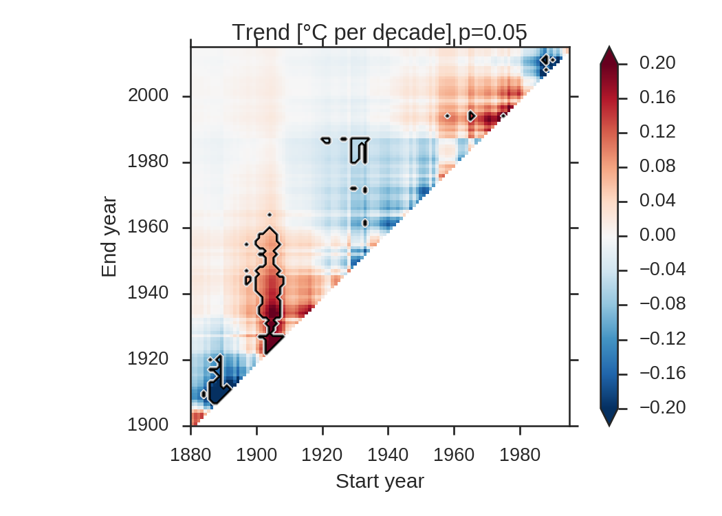
What can we learn from this plot? A non-negligble number of the trends are significant (4.6% to be more specific), and the patterns are temporally coherent. They have to be, since neighboring pixels differ by only one element. In particular, the warming trend between 1900 and 1960 is quite convincing…
While playing around with other random timeseries, I came accross this more extreme example, where 32% of the trends are significant:
Everything is here: the significant warming since 1900 and even the warming pause since the end of the 20th century…
A more systematic bootstrap
To assess how likely this last example is, I made a very simple “brute-force” bootstrap where I created 1000 timeseries and computed the ratio of significant trends in each image. This is what is plotted below:
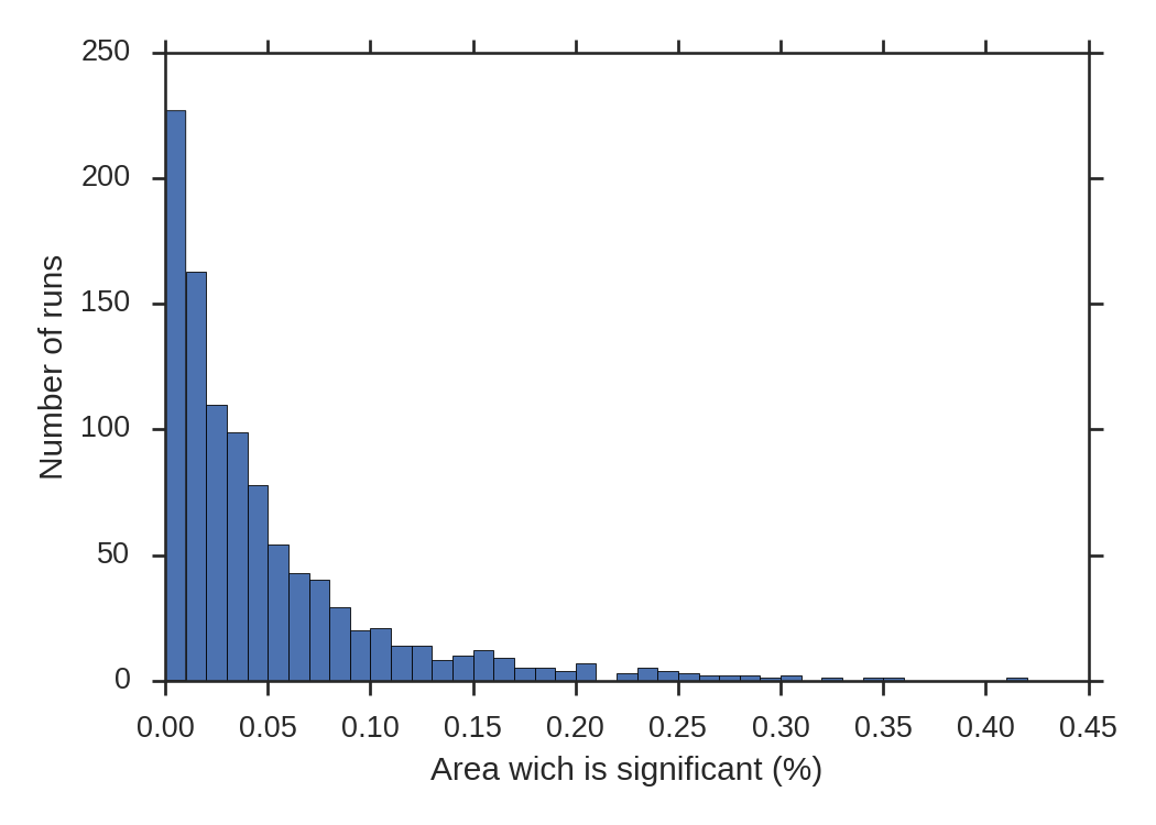
As expected, the average significant area of all these plots is 4.9%. 3.5% of the cases have a significant area above 20%. None of the random timeseries made it above 42%.
Conclusions
I don’t know whether we should discourage the use of such plots. In the GISTEMP case, it is clear that the plot is able to show real features in the timeseries. The fact that 84% of the plotted trends are significant is a clear sign that something is happening. But when the ratio of significant areas goes well below 20 or even 10%, the interpretation of these “triangle plots” becomes really questionable.