

In last weeks literature seminar we discussed a recent paper by D.S. Wilks:
- Wilks, D. S.: “The Stippling Shows Statistically Significant Grid Points”: How Research Results are Routinely Overstated and Overinterpreted, and What to Do about It, Bull. Am. Meteorol. Soc., 97(12), 2263–2273, doi:10.1175/BAMS-D-15-00267.1, 2016
In this paper he revisits an existing method (the “false discovery rate”, or FDR) used to better interpret multiple hypothesis tests.
In a previous post I was talking about this exact same issue, but of course I didn’t propose any fancy metric to make this better. Let’s redo these analyses, but using the FDR approach this time.
Note: the code used to produce the plots below is available here.
Controlling the false discovery rate
Described first by Benjamini and Hochberg (1995) and presented in a climatological context by Wilks (2016), the FDR approach is straightforward to implement:
\[p_{FDR} = max_{i=1,...,N} \left[p_i : p_i \le (i / N) \alpha \right]\]where \(p_{FDR}\) is the threshold level that p-values should not exceed, \(p_i\) the sorted p-values in the grid and \(\alpha\) the threshold chosen originally (0.05 in our previous examples).
This is extremely easy to implement, for example in python:
def fdr_threshold(pvalues, alpha=0.05):
    """Computes the FDR threshod after Wilks (2016)."""
    p = np.sort(np.asarray(pvalues).flatten())
    n = len(p)
    return np.max(np.where(p <= (np.arange(1, n+1) / n * alpha), p, 0))
Revisiting the triangles
Real data case: global temperature anomalies
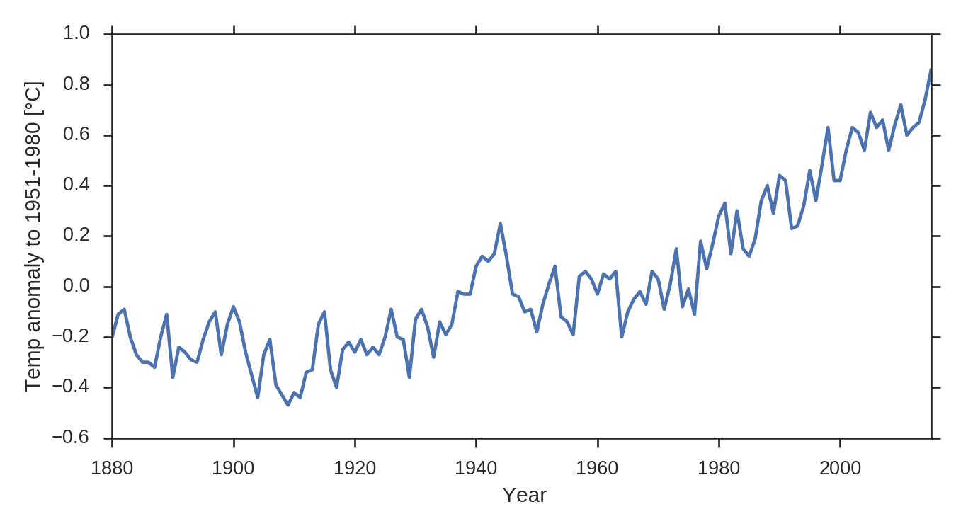
As a reminder, here is the timeseries of the GISTEMP global temperature timeseries:
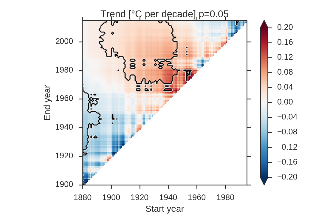
and the corresponding triangle plot:
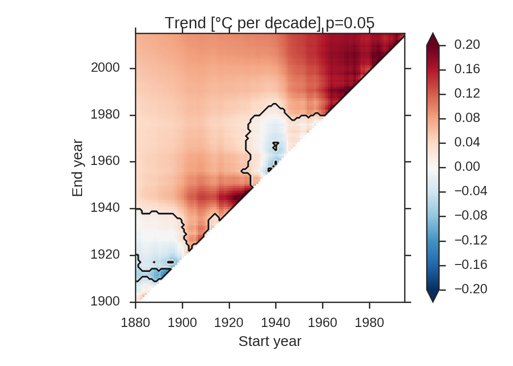
With a p-value of 0.05, 84.3% of the triangle has a significant trend. Let’s compute \(p_{FDR}\) after Wilks (his Figure 3):
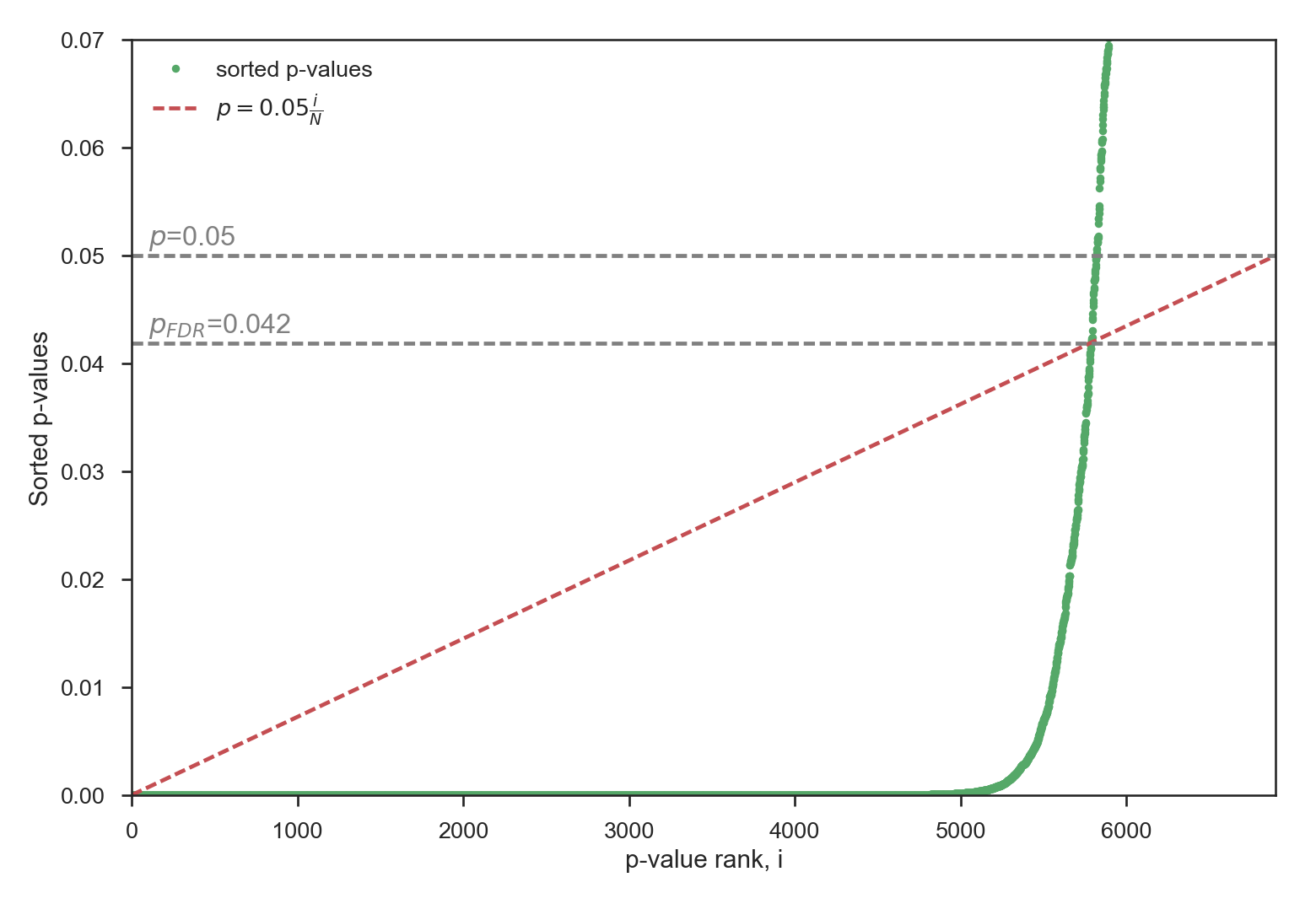
The new p-value is now 0.042, which is slightly lower than the original p-value. With \(p_{FDR}\), 83.9% of the triangle still has a statistically significant trend, thus barely changing anything in the plot.
Random case
As a reminder, here is the triangle plot obtained with completely random data:
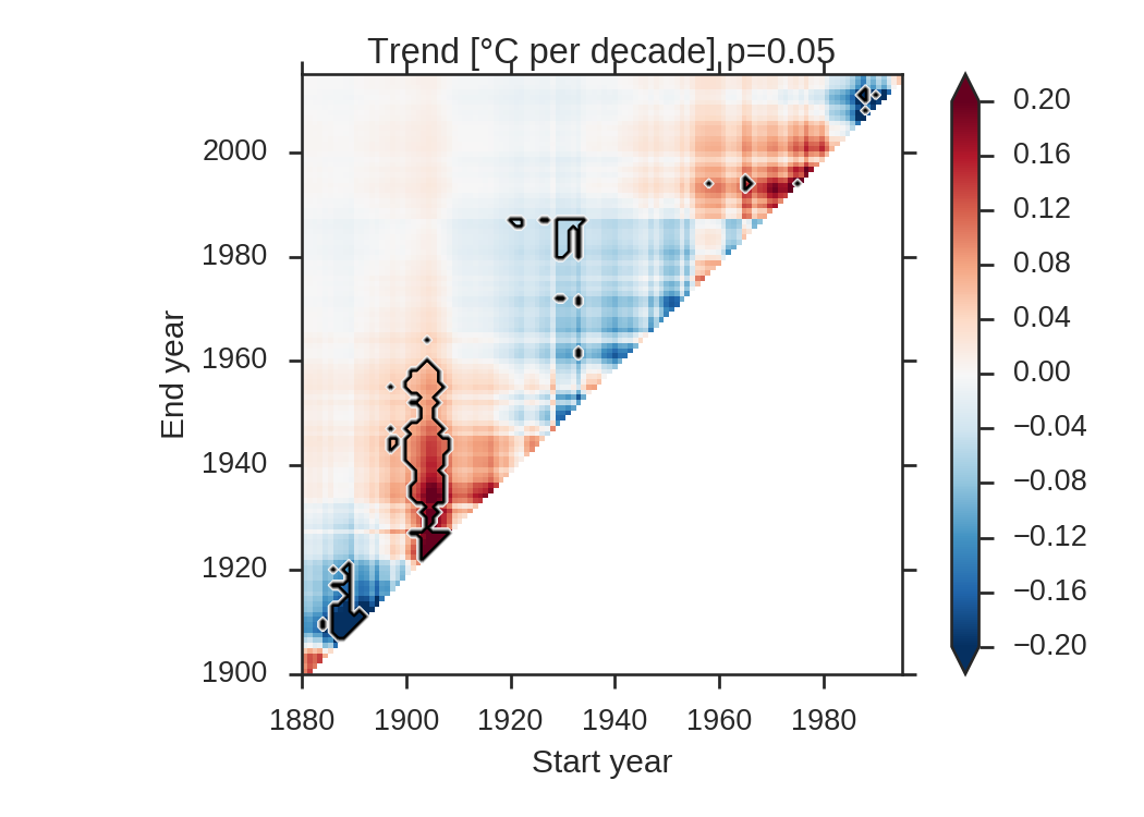
Here, 4.6% of the triangle is significant, thus slightly lower than the percentage we would expect to obtain purely by chance. What will the FDR analysis give us in that case?
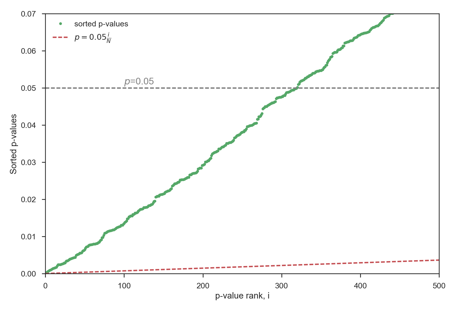
Here, none of the p-value is sufficiently low to fulfill the FDR criteria (note that for this figure the x-axis has been zoomed in). All spurious significant areas in the original plot are now removed!
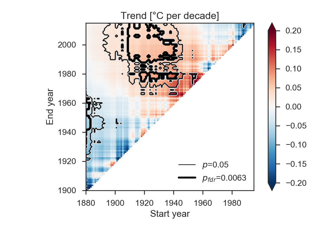
Random case: extreme example
When creating random timeseries, some extreme cases can lead to highly significant areas. The FDR approach leads to:
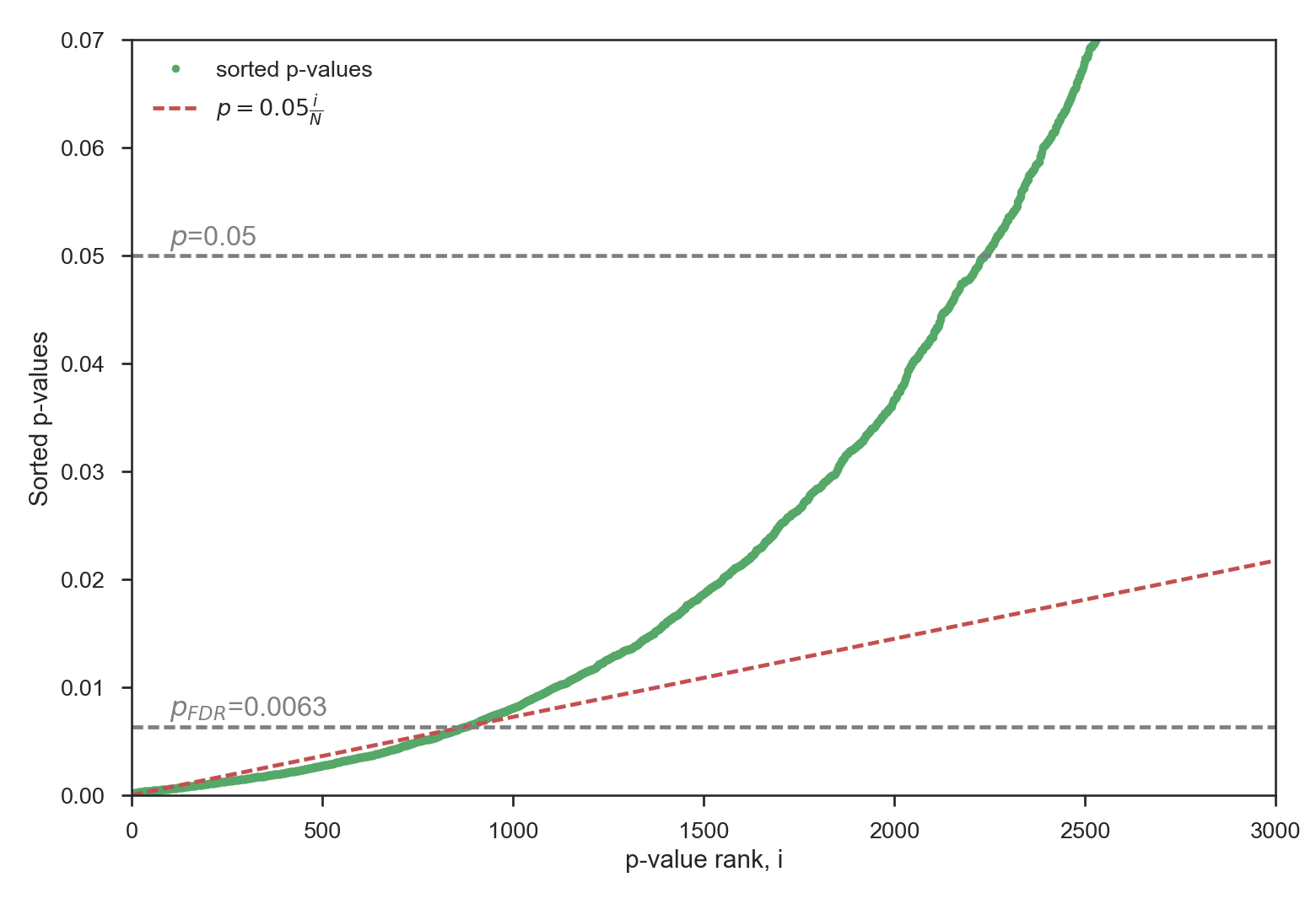
This is a strong reduction of the original p-value, as a result of the many weak (but significant) correlations. Here again, the FDR approach proves to be very efficient by reducing the percentage of significant areas from 32.4% to 12.7%:
Conclusions
The FDR approach is a very easy, straightforward approach to reduce the amount of false positives on a gridded significance plot. Every reviewer should get back to D.S. Wilks paper when dealing with such analyses.