Pre-computed PET and SPEI for ERA5 and CMIP6#
I used the climate_indices software package to compute PET and SPEI for both ERA5 and CMIP6 datasets (at 0.75° and 2° resolution). I processed these myself so that you don’t spend too much time on methodological details: your assessment should focus on climate risks, not on coding the drought-index pipeline from scratch.
Another reason is that the Python spei package used in Workshop 05 does not support calibrating SPEI over a fixed reference period (see this issue). This is a major limitation for climate-change analysis: for SPEI, you want to keep the historical period as the reference climate, rather than “re-normalising” SPEI to future warmer conditions.
Here are the key methodological choices I made:
I computed monthly PET from monthly temperature (both ERA5 and CMIP6) using the Thornwaite method, one of the simplest empirical PET formulations. If you use PET in your report, please look up the method and understand its assumptions and limitations.
SPEI was computed from monthly PET and monthly precipitation at aggregation windows of 3, 6, 12, and 24 months.
The Pearson Type III distribution parameters were calibrated over 1981–2010, consistently for ERA5 and all CMIP6 scenarios. This allows meaningful comparisons between historical and future SPEI.
Data access: PET and SPEI files are available for download on the QCR teaching server alongside the regridded temperature and precipitation fields.
2010 Horn of Africa drought with ERA5 SPEI#
I downloaded the data beforehand (ERA5 at the “ultra–low resolution” grid and the BCC model at 2° resolution). I’m still using the plotting capabilities of spei for illustration:
# Import the tools we are going to need today:
import matplotlib.pyplot as plt  # plotting library
import numpy as np  # numerical library
import xarray as xr  # netCDF library
import cartopy  # Map projections libary
import cartopy.crs as ccrs  # Projections list
import spei  # Plotting SPEI
# Some defaults:
plt.rcParams['figure.figsize'] = (12, 5)  # Default plot size
era_ds = xr.open_dataset('../data/ERA5_UltraLowRes_Monthly_spei.nc')
era_ds
<xarray.Dataset> Size: 143MB
Dimensions:          (time: 552, latitude: 90, longitude: 180)
Coordinates:
  * time             (time) datetime64[ns] 4kB 1979-01-01 ... 2024-12-01
  * latitude         (latitude) float64 720B 89.0 87.0 85.0 ... -87.0 -89.0
  * longitude        (longitude) float64 1kB -179.0 -177.0 ... 177.0 179.0
Data variables:
    spei_pearson_03  (time, latitude, longitude) float32 36MB ...
    spei_pearson_06  (time, latitude, longitude) float32 36MB ...
    spei_pearson_12  (time, latitude, longitude) float32 36MB ...
    spei_pearson_24  (time, latitude, longitude) float32 36MB ...
Attributes:
    Conventions:  CF-1.7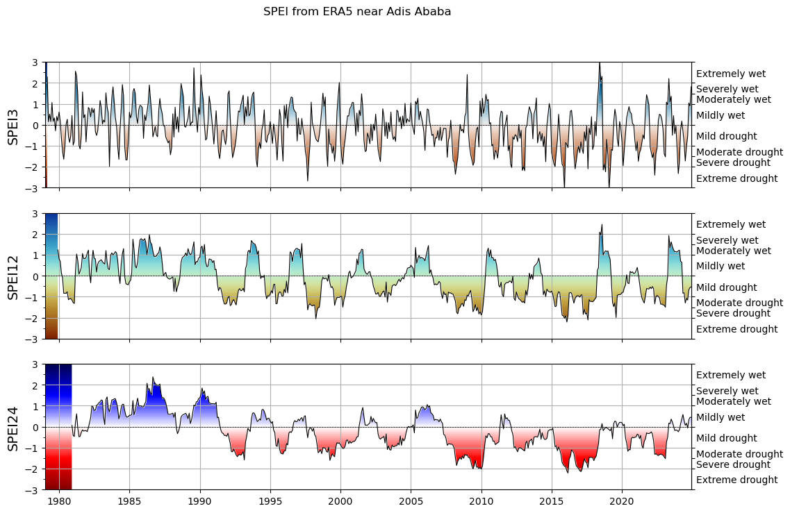
institution: European Centre for Medium-Range Weather Forecastsdf_adis_ababa = era_ds.sel(longitude=38.7525, latitude=9.0192, method='nearest').to_dataframe()
spei3 = df_adis_ababa['spei_pearson_03']
spei12 = df_adis_ababa['spei_pearson_12']
spei24 = df_adis_ababa['spei_pearson_24']
f, ax = plt.subplots(3, 1, figsize=(12, 8), sharex=True)

# choose a colormap to your liking:
spei.plot.si(spei3, ax=ax[0], cmap="vik_r")
spei.plot.si(spei12, ax=ax[1], cmap="roma")
spei.plot.si(spei24, ax=ax[2], cmap="seismic_r")
# ax[0].set_xlim(pd.to_datetime(["1994", "1998"]))
[x.grid() for x in ax]
[ax[i].set_ylabel(n, fontsize=14) for i, n in enumerate(["SPEI3", "SPEI12", "SPEI24"])];
plt.suptitle('SPEI from ERA5 near Adis Ababa');
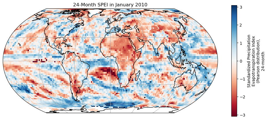
# Define the map projection (how does the map look like)
ax = plt.axes(projection=ccrs.EqualEarth())
# ax is an empty plot. We now plot the variable onto ax
era_ds['spei_pearson_24'].sel(time='2010-01-01').plot(ax=ax, transform=ccrs.PlateCarree(), cmap='RdBu')
# the keyword "transform" tells the function in which projection the data is stored
ax.coastlines(); ax.gridlines(); # Add gridlines and coastlines to the plot
plt.title('24-Month SPEI in January 2010');
SPEI change#
ssp126_ds = xr.open_dataset('../data/BCC-CSM2-MR_ssp126_regridded_spei.nc')
ssp585_ds = xr.open_dataset('../data/BCC-CSM2-MR_ssp585_regridded_spei.nc')
ssp126_adis_ababa = ssp126_ds.sel(longitude=38.7525, latitude=9.0192, method='nearest').to_dataframe()
ssp585_adis_ababa = ssp585_ds.sel(longitude=38.7525, latitude=9.0192, method='nearest').to_dataframe()
df = ssp126_adis_ababa[['spei_pearson_24']].copy()
df.columns = ['SSP126']
df['SSP585'] = ssp585_adis_ababa['spei_pearson_24']
df.plot();
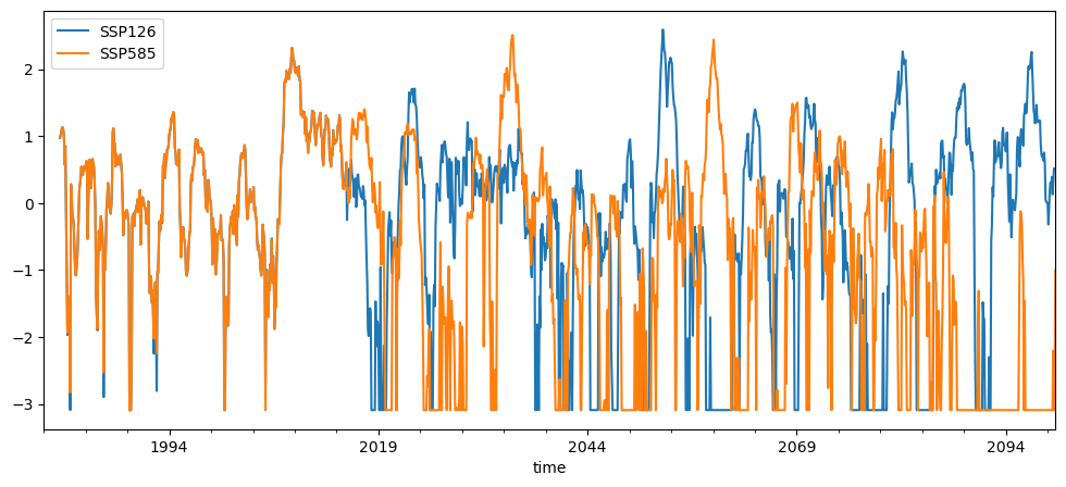
You may notice that in future scenarios (especially SSP585) the SPEI values often hit the lower or upper limits of the scale (e.g. –3 or +3). This is not a bug — it is an important signal.
SPEI is calibrated over a fixed historical reference period (1981–2010 in our case). The model learns what “normal” variability looked like in that climate, and then expresses every later month relative to that historical distribution.
In a warmer climate, PET rises strongly and the water balance (precipitation minus PET) becomes much more negative than anything observed during 1981–2010. When future conditions fall far outside the historical range, the SPEI transformation cannot stretch indefinitely, so values get pushed into the extreme tails of the distribution. This appears as repeated values near –3 (or occasionally +3), which is called saturation.
In practical terms, saturation means: the future drought conditions at this location have no analogue in the historical climate used for calibration. The system is experiencing water deficits that are more extreme than anything in 1981–2010, so the index hits its lower bound. This is exactly why we keep the calibration period fixed: it shows how far future conditions deviate from a familiar baseline.
For your project, it means that you have to plot and treat droughts slightluy differently. I recommend categorizing and counting events rather than plottling timeseries.
For your project, this saturation has an important consequence: you should not rely only on raw SPEI time series for interpretation in the future period. When the index regularly hits its lower bound, the exact numerical value becomes less meaningful.
Instead, I recommend focusing on event-based analysis, for example:
categorising months into drought classes (e.g. SPEI < –1, < –1.5, < –2)
counting the number of drought months per decade
counting the number of distinct drought events
measuring event duration and intensity (e.g. number of consecutive months below a threshold)
These metrics remain interpretable even when the time series saturates, and they allow you to compare changes across scenarios in a clearer and more robust way.