Regional PlateCarree projection#
The final projects may bring you to focus on one specific region. In the few lines of code below you find some examples to get you started. These examples are valid for continents or regions not too far from the equator.
First, the imports. They are the same as always, but I removed the figure size defaults:
# Import the tools we are going to need today:
import matplotlib.pyplot as plt  # plotting library
import numpy as np  # numerical library
import xarray as xr  # netCDF library
import cartopy  # Map projections libary
import cartopy.crs as ccrs  # Projections list
Read and select the regional data#
Reading the data works as always:
ds = xr.open_dataset('../data/ERA5_LowRes_Invariant.nc')
To select the data for a specific region, we will use xarray’s sel function as we learned in the exercises. I’ve made a pre-selection for you but you are free to make the domain bigger/smaller if you find it useful for your analyses! Just uncomment the two lines relevant for your case:
# Africa
ds = ds.sel(latitude=slice(45, -40), longitude=slice(-25, 55))
plt.rcParams['figure.figsize'] = (9, 7)

# # South-America
# ds = ds.sel(latitude=slice(20, -60), longitude=slice(-100, -30))
# plt.rcParams['figure.figsize'] = (9, 7)

# # Australia, New-Zealand, Indonesia
# ds = ds.sel(latitude=slice(15, -55), longitude=slice(105, 180))
# plt.rcParams['figure.figsize'] = (9, 6.5)

# # South-Asia
# ds = ds.sel(latitude=slice(50, 0), longitude=slice(50, 110))
# plt.rcParams['figure.figsize'] = (11, 7)
Note that I set the standard figure size for each region. You can always change those, and also make plots of any size later on (examples below).
Now we read the variable:
z = ds.orography
Alternatively - download regional data#
In the cells above, we use global data that we “cropped” (.sel()) to the region of interest. You may also prefer to download ERA5 data directly for the region of your choice. This can be done easily, check out the example script to do exactly this.
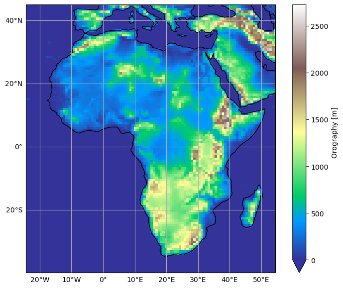
Plot the data#
Plotting the data works the exact same way as during the exercises:
ax = plt.axes(projection=ccrs.PlateCarree())
z.plot(ax=ax, transform=ccrs.PlateCarree(), vmin=0, cmap='terrain')
ax.coastlines();
# We add tick labels to the plot, this will help you in your descriptions:
xl = ax.gridlines(draw_labels=True);
xl.top_labels = False
xl.right_labels = False
# We set the extent of the map
extent = [ds.longitude.min(), ds.longitude.max(), ds.latitude.min(), ds.latitude.max()]
ax.set_extent(extent, crs=ccrs.PlateCarree())
Careful - computing regional averages on the sphere#
Unfortunately, the Earth is still not flat and we also need to take this into account for any regional spatial average you want to compute. The weights computed globally (see workshop 1) can be used for any region you are looking at.
The standard way to deal with weights at the regional scale is to compute a 2D map of weights, and provide them to xarray’s weighted.
In the class I taught you to do it for global domains, but how about regional domains?
Let’s dig into it below:
For a region#
The weights need computed again. Let’s do it like we did in class first:
weight = np.cos(np.deg2rad(ds.latitude))  # Note that this can be computed using the select region

avg_z = ds.orography.mean()  # Incorrect

weighted_avg_z = ds.orography.weighted(weight).mean()  # Correct

print(f'Incorrect average: {avg_z:.1f} m. Correct average: {weighted_avg_z:.1f} m')
Incorrect average: 311.0 m. Correct average: 314.9 m
For Africa, the difference is not large, but it could be larger in other regions.
For a masked region#
You may want to compute the averages for land areas only. For this, you usually mask out the data:
z_land = ds.orography.where(ds.lsm > 0.25)  # Where not entirely ocean
z_land.plot(cmap='viridis', center=False);
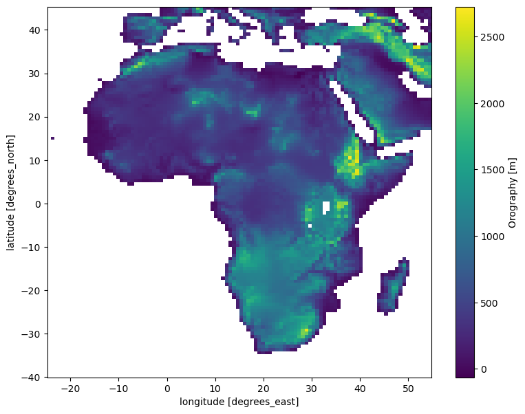
But wait! What is happening to my weights, now that I have varying areas by latitudes where I want to compute the average from?
Fortunately, xarray’s weighted does everything for you:
avg_z_land = z_land.mean()  # Incorrect
weighted_avg_z_land = z_land.weighted(weight).mean()  # Correct

print(f'Incorrect average over land: {avg_z_land:.1f} m. Correct average over land: {weighted_avg_z_land:.1f} m')
Incorrect average over land: 636.6 m. Correct average over land: 636.3 m
The difference is still there, but even smaller.
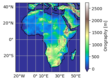
Change some details of the plot#
The plot above looks fine for me. If you want you can change some details for it, for example its size:
# Prepare the figure with the wanted size:
fig = plt.figure(figsize=(5, 3))
# The rest doesn't change:
ax = plt.axes(projection=ccrs.PlateCarree())
z.plot(ax=ax, transform=ccrs.PlateCarree(), vmin=0, cmap='terrain')
ax.coastlines();
xl = ax.gridlines(draw_labels=True);
xl.top_labels = False
xl.right_labels = False
ax.set_extent(extent, crs=ccrs.PlateCarree())
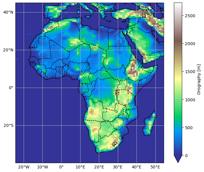
Or you can add country borders if you wish:
ax = plt.axes(projection=ccrs.PlateCarree())
z.plot(ax=ax, transform=ccrs.PlateCarree(), vmin=0, cmap='terrain')
ax.coastlines();
xl = ax.gridlines(draw_labels=True);
xl.top_labels = False
xl.right_labels = False
ax.add_feature(cartopy.feature.BORDERS, linestyle='--');
ax.set_extent(extent, crs=ccrs.PlateCarree())
OK, you should be good now!
Tired of writing so many lines?#
Note that it is possible to simplify your plotting commands by writing a function:
def prepare_plot(figsize=None):
    """This function returns prepared axes for the regional plot.

    Usage:
        fig, ax = prepare_plot()
    """
    fig = plt.figure(figsize=figsize)
    ax = plt.axes(projection=ccrs.PlateCarree())
    ax.coastlines();
    xl = ax.gridlines(draw_labels=True);
    xl.top_labels = False
    xl.right_labels = False
    ax.add_feature(cartopy.feature.BORDERS, linestyle='--');
    ax.set_extent(extent, crs=ccrs.PlateCarree())
    return fig, ax
Now, making a plot has become even easier:
fig, ax = prepare_plot()
z.plot(ax=ax, transform=ccrs.PlateCarree(), vmin=0, cmap='terrain');
Need to save the plot for your report?#
The easiest way is to use “right-click -> save as” on the image in the notebook.
Also, you can save the plot as pdf or png quite easily (examples below). But this might look quite different as the picture on screen sometimes…
fig, ax = prepare_plot()
z.plot(ax=ax, transform=ccrs.PlateCarree(), vmin=0, cmap='terrain');
plt.savefig('topo.pdf')
fig, ax = prepare_plot()
z.plot(ax=ax, transform=ccrs.PlateCarree(), vmin=0, cmap='terrain');
plt.savefig('topo.png')