Lesson: organise your datasets, select data by country, droughts#
In this lesson, we will now go back to NetCDF files and gridded data analysis. We will mix up xarray and pandas to get to our new goal today: studying droughts.
ERA5 data#
Let’s start by opening (and downloading if necessary) our now familiar ERA5 temperature dataset:
# Import the tools we are going to need today:
import matplotlib.pyplot as plt  # plotting library
import numpy as np  # numerical library
import xarray as xr  # netCDF library
import cartopy  # Map projections libary
import cartopy.crs as ccrs  # Projections list
# Some defaults:
plt.rcParams['figure.figsize'] = (12, 5)  # Default plot size
ds = xr.open_dataset('../data/ERA5_LowRes_Monthly_t2m.nc')
ds
<xarray.Dataset> Size: 255MB
Dimensions:    (time: 552, latitude: 241, longitude: 480)
Coordinates:
  * time       (time) datetime64[ns] 4kB 1979-01-01 1979-02-01 ... 2024-12-01
  * latitude   (latitude) float64 2kB 90.0 89.25 88.5 ... -88.5 -89.25 -90.0
  * longitude  (longitude) float64 4kB -179.6 -178.9 -178.1 ... 178.9 179.6
Data variables:
    t2m        (time, latitude, longitude) float32 255MB ...
Attributes:
    Conventions:  CF-1.7
institution: European Centre for Medium-Range Weather ForecastsSo far, we have mostly worked with NetCDF datasets containing a single data variable. In practice, climate datasets often include several variables within the same file. This has some advantages, as we’ll see shortly.
Let’s now open two additional datasets: precipitation (which you already know) and PET (potential evapotranspiration), which is new and needs to be downloaded first.
ds_tp = xr.open_dataset('../data/ERA5_LowRes_Monthly_tp.nc')
ds_pet = xr.open_dataset('../data/ERA5_LowRes_Monthly_pet.nc')
Explore the ds_pet dataset.
What are the units and long_name of the variable
pet_thornthwaite?What does PET stand for?
Look up how the Thornthwaite method works and what input data it uses.
# Your answer here
The units of PET are not given correctly: they should read mm/month.
This is a very common issue in climate datasets. Fluxes such as precipitation or PET should be expressed per unit time (e.g. mm/day or mm/month), but metadata often omit the “per time” part.
Our ERA5 precipitation data are in m/day (but described as “m”).
Let’s convert them all to mm/month so PET and TP are comparable:
# Convert and update units of tp
days_in_month = ds_tp['time'].dt.days_in_month
tp = ds_tp['tp'] * days_in_month * 1000
tp.attrs['units'] = 'mm/month'

# Also correct tp's time - for some reason it shows up as 6am
tp['time'] = ds['time']

# Let's also read PET and update units
pet = ds_pet['pet_thornthwaite']
pet.attrs['units'] = 'mm/month'
Organise data in datasets#
Now we have three variables: t2m, pet, and tp. It is possible (and not necessarily wrong) to keep these variables in separate datasets and run your analysis workflows on each of them individually.
However, you will quickly notice that this leads to a lot of repeated code — often changing only the variable name between lines.
To avoid this (and to reduce the risk of copy-paste errors), it is often more convenient to organise all variables into a single dataset.
Let’s do that:
ds['tp'] = tp
ds['pet'] = pet
ds
<xarray.Dataset> Size: 1GB
Dimensions:    (time: 552, latitude: 241, longitude: 480)
Coordinates:
  * time       (time) datetime64[ns] 4kB 1979-01-01 1979-02-01 ... 2024-12-01
  * latitude   (latitude) float64 2kB 90.0 89.25 88.5 ... -88.5 -89.25 -90.0
  * longitude  (longitude) float64 4kB -179.6 -178.9 -178.1 ... 178.9 179.6
Data variables:
    t2m        (time, latitude, longitude) float32 255MB ...
    tp         (time, latitude, longitude) float64 511MB 9.106 9.106 ... 2.01
    pet        (time, latitude, longitude) float32 255MB ...
Attributes:
    Conventions:  CF-1.7
institution: European Centre for Medium-Range Weather Forecastsds now has three variables. The advantage is that methods that work on variables often work on datasets as well. See for example:
# "as" stands for "annual sums"
as_ds = ds.resample(time='YS').sum().mean(dim='time')
What operation have we just performed? Consider each step one by one to make sure you understand what’s going on. This operation makes sense for tp and pet — but does it also make sense for t2m?
Now plot the annual sums of tp and pet, as well as the diffence tp - pet on a map. Interpret what you see.
# Your answer here
Select data by country#
To select data by country, we’ll use the regionmask package.
If you don’t already have it installed (sorry I forgot to add it to the list this year), you can add it to your environment using either conda or mamba. In a terminal, do:
conda activate qcr
And then (depending on wether you use conda or mamba):
conda install -c conda-forge regionmask
or
mamba install -c conda-forge regionmask
Once installed, you can import it as usual:
import regionmask
Regionmask helps to create masks by countries (or any other vector boundary). We’ll stick to countries here:
# Load built-in country polygons
countries = regionmask.defined_regions.natural_earth_v5_0_0.countries_110

# Print all available names
print(countries.names)
['Fiji', 'Tanzania', 'W. Sahara', 'Canada', 'United States of America', 'Kazakhstan', 'Uzbekistan', 'Papua New Guinea', 'Indonesia', 'Argentina', 'Chile', 'Dem. Rep. Congo', 'Somalia', 'Kenya', 'Sudan', 'Chad', 'Haiti', 'Dominican Rep.', 'Russia', 'Bahamas', 'Falkland Is.', 'Norway', 'Greenland', 'Fr. S. Antarctic Lands', 'Timor-Leste', 'South Africa', 'Lesotho', 'Mexico', 'Uruguay', 'Brazil', 'Bolivia', 'Peru', 'Colombia', 'Panama', 'Costa Rica', 'Nicaragua', 'Honduras', 'El Salvador', 'Guatemala', 'Belize', 'Venezuela', 'Guyana', 'Suriname', 'France', 'Ecuador', 'Puerto Rico', 'Jamaica', 'Cuba', 'Zimbabwe', 'Botswana', 'Namibia', 'Senegal', 'Mali', 'Mauritania', 'Benin', 'Niger', 'Nigeria', 'Cameroon', 'Togo', 'Ghana', "Côte d'Ivoire", 'Guinea', 'Guinea-Bissau', 'Liberia', 'Sierra Leone', 'Burkina Faso', 'Central African Rep.', 'Congo', 'Gabon', 'Eq. Guinea', 'Zambia', 'Malawi', 'Mozambique', 'eSwatini', 'Angola', 'Burundi', 'Israel', 'Lebanon', 'Madagascar', 'Palestine', 'Gambia', 'Tunisia', 'Algeria', 'Jordan', 'United Arab Emirates', 'Qatar', 'Kuwait', 'Iraq', 'Oman', 'Vanuatu', 'Cambodia', 'Thailand', 'Laos', 'Myanmar', 'Vietnam', 'North Korea', 'South Korea', 'Mongolia', 'India', 'Bangladesh', 'Bhutan', 'Nepal', 'Pakistan', 'Afghanistan', 'Tajikistan', 'Kyrgyzstan', 'Turkmenistan', 'Iran', 'Syria', 'Armenia', 'Sweden', 'Belarus', 'Ukraine', 'Poland', 'Austria', 'Hungary', 'Moldova', 'Romania', 'Lithuania', 'Latvia', 'Estonia', 'Germany', 'Bulgaria', 'Greece', 'Turkey', 'Albania', 'Croatia', 'Switzerland', 'Luxembourg', 'Belgium', 'Netherlands', 'Portugal', 'Spain', 'Ireland', 'New Caledonia', 'Solomon Is.', 'New Zealand', 'Australia', 'Sri Lanka', 'China', 'Taiwan', 'Italy', 'Denmark', 'United Kingdom', 'Iceland', 'Azerbaijan', 'Georgia', 'Philippines', 'Malaysia', 'Brunei', 'Slovenia', 'Finland', 'Slovakia', 'Czechia', 'Eritrea', 'Japan', 'Paraguay', 'Yemen', 'Saudi Arabia', 'Antarctica', 'N. Cyprus', 'Cyprus', 'Morocco', 'Egypt', 'Libya', 'Ethiopia', 'Djibouti', 'Somaliland', 'Uganda', 'Rwanda', 'Bosnia and Herz.', 'North Macedonia', 'Serbia', 'Montenegro', 'Kosovo', 'Trinidad and Tobago', 'S. Sudan']
Let’s build a mask for all countries, same shape as our data:
# Create a mask for all countries
mask = countries.mask(ds['longitude'], ds['latitude'])
mask.plot();
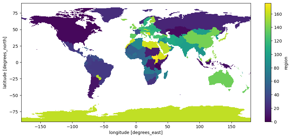
And look-up what ID the UK has:
# Look up the UK’s region number
uk_id = countries.map_keys('United Kingdom')
print(uk_id)
143
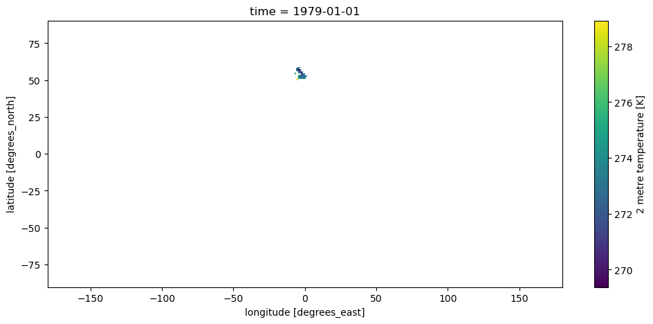
With this information, we are now able to select the data we are interested in, which in xarray means relplacing all pixels outside of it with NaNs:
ds_sel = ds.where(mask == uk_id)
ds_sel['t2m'].isel(time=0).plot();
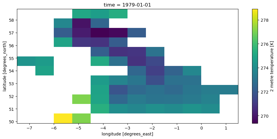
It is sometimes better to also remove all the unnecessary NaNs around our selection:
ds_uk = ds.where(mask == uk_id, drop=True)
ds_uk['t2m'].isel(time=0).plot();
And finally, let’s learn how to make a nicer map from this:
ax = plt.axes(projection=ccrs.LambertConformal(central_longitude=-3, central_latitude=50))
ax.set_extent([-8, 3, 49, 60], ccrs.PlateCarree())
ax.coastlines(); ax.gridlines(); ax.add_feature(cartopy.feature.BORDERS);
ds_uk['t2m'].isel(time=0).plot(ax=ax, transform=ccrs.PlateCarree());
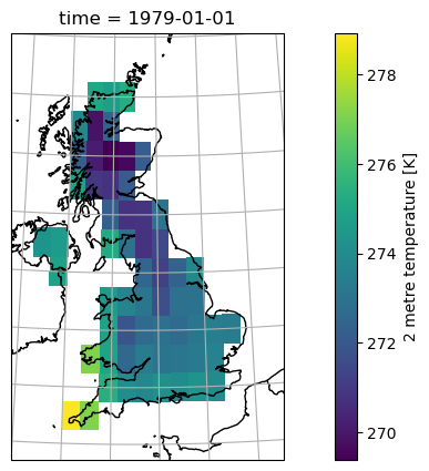
You’ll be given more inputs on maps with a “recipe” soon.
Droughts and SPEI#
In this final section, we’ll take the data we’ve prepared — temperature, precipitation, and PET — and use it to analyse drought variability. This section is mostly about the code and explaining the SPEI - we’ll focus on interpretations in the assignment.
Let’s select our time series of temperature, precipitation, and PET close to London:
dsl = ds.sel(latitude=51.5072, longitude=0.1276, method='nearest')
Note that I could also have averaged the data over the entire UK — and if I did so, I should not forget to use weighted averages, right?
Because we now have time series data for a single grid cell, it’s convenient to convert it to a pandas DataFrame.
We don’t need the latitude and longitude columns for a single-point series, so we’ll drop them:
df = dsl.to_dataframe().drop(columns=['latitude', 'longitude'])
df['t2m'] = df['t2m'] - 273.15  # To Celsius
df
| t2m | tp | pet | |
|---|---|---|---|
| time | |||
| 1979-01-01 | 0.474518 | 62.971115 | 1.011671 |
| 1979-02-01 | 1.430878 | 67.050934 | 3.770684 |
| 1979-03-01 | 5.016632 | 93.008041 | 20.652092 |
| 1979-04-01 | 7.825409 | 83.656311 | 38.842426 |
| 1979-05-01 | 10.742035 | 117.191315 | 64.859535 |
| ... | ... | ... | ... |
| 2024-08-01 | 18.661682 | 29.859543 | 111.808380 |
| 2024-09-01 | 15.060547 | 98.590851 | 72.991951 |
| 2024-10-01 | 12.001129 | 52.623749 | 48.645039 |
| 2024-11-01 | 7.781097 | 58.050156 | 23.933279 |
| 2024-12-01 | 7.230377 | 48.780441 | 20.503212 |
552 rows × 3 columns
Do you remember what t2m, tp and pet represent, and what their units are? If not, go back to the top of this notebook.
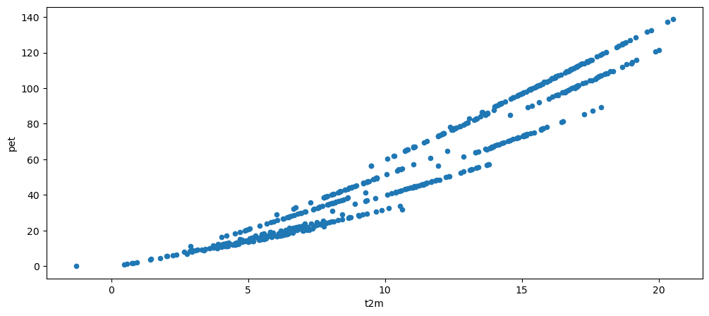
Now plot a scatter plot of t2m vs pet, and interpret what you see.
# Your answer here
df.plot.scatter(x='t2m', y='pet');
Water balance#
Now let’s compute the monthly water balance (mm/month), defined as:
where positive values indicate a water surplus (precipitation exceeds PET), and negative values indicate a deficit.
wb = df['tp'] - df['pet']  # Water balance

wb.plot(label='Monthly water balance');
wb.rolling(window=12).mean().plot(label='12-months averages');
plt.ylabel('mm/month'); plt.legend();
plt.title('Monthly water balance from ERA5 near London, UK');
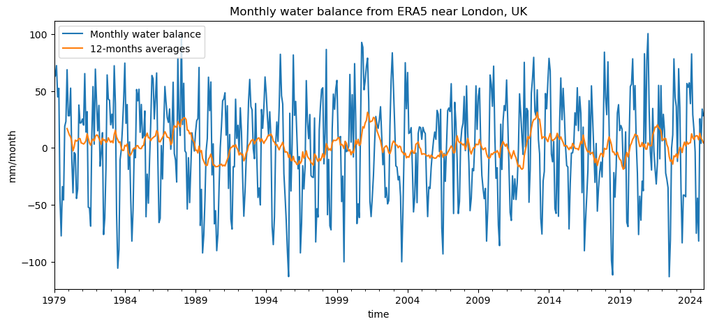
Can you already identify periods of drought (sustained negative water balance) in the monthly data?
How do these appear when looking at the 12-month moving average (orange line)?
Which series (monthly or 12-month) would you trust more to identify long-term droughts, and why?
Introducing the Standardised Precipitation–Evapotranspiration Index (SPEI)#
So far, we’ve looked at the monthly water balance (P − PET) — the difference between water supply and loss by evaporation. This gives us a first impression of when and where water deficits (droughts) or surpluses (wet periods) occur.
However, the raw water balance has some limitations:
Its mean and variance depend on the local climate — a value of −50 mm/month may mean something very different in Spain than in Scotland.
It’s not easy to compare anomalies across regions or between seasons.
We don’t have a clear threshold for when conditions become “dry enough” to be considered a drought.
To overcome these issues, scientists developed the Standardised Precipitation–Evapotranspiration Index (SPEI, Vicente-Serrano et al., 2010).
What SPEI does#
SPEI transforms the raw water balance into a dimensionless index that tells us how unusual a given month’s conditions are compared to the long-term record at that location.
It does this in three main steps:
Accumulate the water balance over a given time window (e.g. 1, 3, 6, or 12 months).
Short timescales capture short, intense dry spells.
Long timescales capture multi-season or hydrological droughts.
Fit a probability distribution to the long-term series of accumulated water balance values
(typically a log-logistic or Pearson type III distribution).Standardise the values (transform them into z-scores), so that:
0 → average conditions
−1 → moderate drought (about the 15th percentile)
−2 → severe drought
+1 → unusually wet period
etc
The result is comparable across regions and climates — an SPEI = −2 means an equally rare dry event anywhere on Earth.
SPEI is now one of the most widely used indices for analysing and monitoring climatic droughts,
because it captures both precipitation deficits and the increasing evaporative demand due to warming.
Computing SPEI in Python#
We’ll use the open-source spei Python package, which implements the methods described above.
We can simply feed our water balance time series into the function and compute SPEI for different accumulation timescales (e.g. 3, 12, 24 months) — just as it is done in published drought datasets such as SPEIbase.
Let’s try it out!
Here again we need to install the packag (sorry I forgot to add it to the list this year), you can add it to your environment using a slightly different method than usual. In a terminal, do:
conda activate qcr
And then (regardless on wether you use conda or mamba):
pip install spei
Once installed, you can import it as usual:
import spei
The spei package allows us to compute the SPEI from the water balance at our chosen timescales:
spei3 = spei.spei(wb, timescale=3)
spei12 = spei.spei(wb, timescale=12)
spei24 = spei.spei(wb, timescale=24)
And it also comes with plotting functions:
f, ax = plt.subplots(3, 1, figsize=(12, 8), sharex=True)

# choose a colormap to your liking:
spei.plot.si(spei3, ax=ax[0], cmap="vik_r")
spei.plot.si(spei12, ax=ax[1], cmap="roma")
spei.plot.si(spei24, ax=ax[2], cmap="seismic_r")
# ax[0].set_xlim(pd.to_datetime(["1994", "1998"]))
[x.grid() for x in ax]
[ax[i].set_ylabel(n, fontsize=14) for i, n in enumerate(["SPEI3", "SPEI12", "SPEI24"])];
plt.suptitle('SPEI from ERA5 near London');
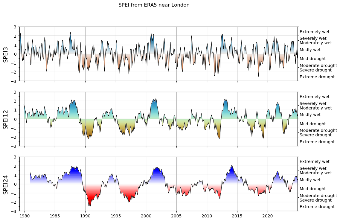
Quite pretty! We will revisit these time series and what they mean in the weekly assignment.
What’s next?#
You are now ready for this week’s assignment!