Lesson: extreme value distributions#
Understanding and modeling extreme events, such as severe floods or heatwaves, is crucial in climate science and risk assessment. In this lesson, we will delve into the limitations of empirical return periods and introduce the Generalized Extreme Value (GEV) distribution as a robust alternative for modeling extreme events.
Learning Outcomes:
By the end of this lesson, you will be able to:
Understand the limitations of empirical return periods: Recognize the constraints of using empirical return periods, especially with limited data.
Fit the GEV distribution: Utilize Python libraries to fit the GEV distribution to extreme event data.
Calculate return levels and periods using the GEV: Derive return levels and periods from the GEV distribution to predict the likelihood of future extreme events.
Copyright notice: substantial parts of this class are inpired by the excellent climatematch tutorials. I really recommend you to check them out!
Let’s start by importing the packages as usual. We’ll continue to use Pandas today.
import numpy as np
import matplotlib.pyplot as plt
import pandas as pd
from scipy import stats
Revisiting the 1968 Bristol flood#
After last week’s assignment, the catchment daily rainfall data (53004_cdr.csv) should already be in your data/csv folder. As a reminder, these are gridded precipitation data averaged over the Chew river catchment near Bristol.
We’ll resume our work on the daily rainfall timeseries. Let me do all the reading for you:
df = pd.read_csv('../data/csv/53004_cdr.csv', skiprows=19, index_col=0, parse_dates=True)
df.index.name = 'Date'
df.columns = ['cdr', 'qual']

# Check that time series is complete
assert len(df) == len(pd.date_range(df.index[0], df.index[-1], freq='D'))
assert df['cdr'].isnull().sum() == 0

# Extract cdr
cdr = df['cdr']
Generalise the computation of empirical return periods with a function#
As explained in the previous lesson, computing return periods involves ranking the data and then calculating return periods based on these ranks.
An event of rank 1 has a low probability of exceedance and a long return period.
An event ranked last has a high probability of exceedance and a short return period.
These probabilities and ranks can be computed on data of any size and type, making it possible to generalize the process into a function:
def return_period(sample):
    """Compute the empirical return periods of a sample of extreme events.

    Parameters
    ----------
    sample : pandas.Series
        A pandas Series containing observed extreme event magnitudes (e.g., annual maximum
        precipitation, flood peaks, extreme temperatures).

    Returns
    -------
    edf : pandas.DataFrame
        A DataFrame containing:
        - 'sorted': The observed values sorted in descending order.
        - 'ranks': The rank of each value
        - 'exceedance': The empirical exceedance probability (rank / (N + 1)).
        - 'period': The empirical return period (1 / exceedance).

    Notes
    -----
    - The function assumes that the input data represents independent extreme events.
    - The return period is an estimate based on the empirical data and does not assume a fitted
      probability distribution.
    """
    edf = pd.DataFrame(index=np.arange(1, len(sample)+1))
    edf['sorted'] = sample.sort_values(ascending=False).values
    edf['ranks'] = np.sort(stats.rankdata(-edf['sorted']))
    edf["exceedance"] = edf["ranks"] / (len(edf) + 1)
    edf["period"] = 1 / edf["exceedance"]
    return edf
No need to learn the details of python functions if you don’t want to - but if you want a gentle but thorough introduction, check out the Python4Everybody lecture notes.
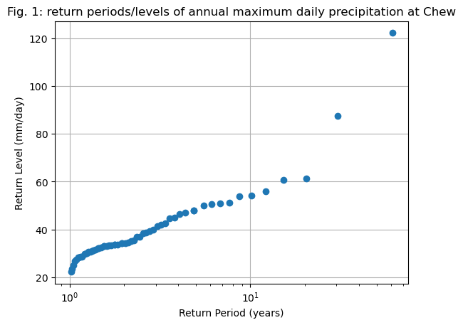
Using this function, it’s simple to compute the empirical return levels of any sample, say for example annual extreme daily precipitation at Chew valley:
# Annual daily maxima
annual_max = cdr.resample('YS').max()

# Compute the statistics
edf = return_period(annual_max)

# Plot them
fig, ax = plt.subplots()
ax.plot(edf['period'], edf['sorted'], "o")
ax.grid(True)
ax.set_title('Fig. 1: return periods/levels of annual maximum daily precipitation at Chew')
ax.set_xlabel("Return Period (years)")
ax.set_ylabel("Return Level (mm/day)")
ax.set_xscale("log"); # ax.set_yscale("log");
Now let’s make an experiment. How would the return levels change if the most extreme event didn’t happen and was replaced, say, with a “normal” annual precipitation maxima? Let’s test this scenario:
# Annual daily maxima - but altered
# We copy the real data...
annual_max_fake = annual_max.copy()
# ... and replace the max value with the median
annual_max_fake.loc[annual_max_fake.idxmax()] = np.median(annual_max_fake)
E: Explore the content of annual_max and annual_max_fake. Can you spot the one difference? What is the new maximal value for annual_max_fake?
# Your answer here
Good. Now I’ll make a new plot with the real data and the “altered” data series:
# Compute the statistics
edf_fake = return_period(annual_max_fake)

# Plot them
fig, ax = plt.subplots()
ax.plot(edf['period'], edf['sorted'], "o", label='Empirical')
ax.plot(edf_fake['period'], edf_fake['sorted'], "o", label='"Altered"')
ax.grid(True)
ax.set_title('Fig. 2: Return periods/levels of annual maximum daily precipitation at Chew')
ax.set_xlabel("Return Period (years)")
ax.set_ylabel("Return Level (mm/day)")
plt.legend();
ax.set_xscale("log"); # ax.set_yscale("log");
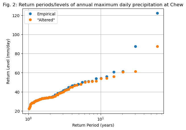
E: either by looking at the plot (with or without logarithmic scales) or by looking at the edf and edf_fake variables, answer the following questions:
what is the approximate return level of a 30-year precipitation event in each case (real or “altered”)?
what is the approximate return period of a 55 mm/day precipitation event in each case (real or “altered”)?
is there any visible impact for the “lower” extreme values, i.e. < 30 mm/day?
Discuss the robustness of empirical return periods based on this simple example.
# Your answer here
Going further: get a sense of empirical uncertainty with “bootstrapping”#
We have seen above that even a very small change in the data series can have large consequences for the computation of return levels and return periods, especially for very rare events. Intuitively, this makes sense: rare events are, by definition, rare and difficult to predict. Until they actually occur, we are prone to making large errors in estimating their probability of occurrence or their intensity.
Another way to understand this uncertainty is by considering the 1968 flood event. It occurred after only 10 years of measurements, meaning that if we had performed this exercise at the time, its empirical return period would have been estimated at 10 years. Today, after 60 years of measurements, the empirical return period has increased to 60 years because no stronger event has occurred since. In short, we have likely still underestimated the true return period of this event, as we can’t predict how long this event will continue to be the largest ever recorded.
Beyond these qualitative considerations, there are more quantitative methods to explore the uncertainty arising from the fact that our records are always too short to fully capture extreme values - even when they span 60 years. A key technique that allows us to assess this uncertainty using the data itself is called bootstrapping, named after the saying “pulling oneself up by one’s bootstraps.” In essence, we will leverage our limited dataset to estimate the uncertainty that arises from its finite length.
Quoting climatematch:
This method works by assuming that while we have limited data, the data that we do have is nevertheless a representative sample of possible events - that is we assume that we did not miss anything systematic. Then, we use the data as a distribution to draw “fake” observations from, and compute uncertainties using those:
We pull artificial observations from our data - with replacement.
We draw as many observations as our data record is long. This record will now only include data points that we observed before, but some will show up several times, some not at all.
We compute our statistics over this artifical record - just as we did to the record itself.
We repeat this process many times.
Thus we compute our statistics over many artificial records, which can give us an indication of the uncertainty. Remember, this only works under the assumption that our data is representative of the process - that we did not systematically miss something about the data. We cannot use this to estimate measurements errors for example.
Bootstrapping is relatively easy to implement, but it requires the use of “for” loops. Learning for-loops is not part of this lecture, therefore let me do this for you now. I can only recommend you to try to understand the code below the best you can:
# setup figure
fix, ax = plt.subplots()

# create 1000 resamples of the data
for i in range(1000):

    # Create a fake sample, with some years removed or pulled twice, but always of the same length
    sample = annual_max.sample(n=len(annual_max), replace=True)
    # Compute the return periods
    edf_s = return_period(sample)
    # Plot them as transparent black lines
    ax.plot(edf_s['period'], edf_s['sorted'], color='k', alpha=0.2, linewidth=0.1)

# Now plot the "true" ones
edf = return_period(annual_max)
ax.plot(edf['period'], edf['sorted'], "o")
ax.grid(True)
ax.set_title('Fig. 3: Return periods/levels of annual maximum daily precipitation at Chew')
ax.set_xlabel("Return Period (years)")
ax.set_ylabel("Return Level (mm/day)")
ax.set_xscale("log"); # ax.set_yscale("log");
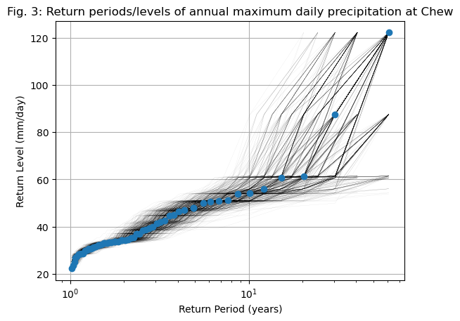
The plot above (Fig. 3) is a generalisation of “Fig. 2” further up. While the previous attempt was only one example, in the above we explored many other possible sequences of 60 years, where certain extreme events happened more, or less often than they happened in reality.
Q: by looking at the plot (possibly by trying with / without logarithmic axes), answer the following questions:
What is the full possible range of return periods for a 100 mm/day event, based on the bootstrapped samples?
What is the full possible range of return levels for a 50-year event, based on the bootstrapped samples?
Where is the spread of possible outcomes largest? Can you make sense of why?
# Your answer here
The GEV distribution#
To address some of the limitations of empirical return values and to make predictions about return levels and return periods for events that haven’t occurred yet, risk analysts rely on a branch of statistics called extreme value theory. We won’t cover all the details here (you’ll learn them if you need them for your dissertation or future job!) but it’s still useful to have a basic understanding of how it works.
Let’s start by recalling that probabilities of exceedance (the inverse of return periods) can be computed from theoretical distributions. Last week, we used a Gaussian distribution to calculate probabilities of exceedance. The approach we’ll take here follows the same principle, but with one key observation: while a Gaussian distribution provides a reasonable representation of daily temperatures, it does not adequately capture extreme values:
bins = np.arange(20, 130, 4)

annual_max.plot.hist(edgecolor='k', bins=bins, density=True, label='Events');
plt.title('Histogram of annual max daily precipitation at Chew');
plt.xlabel('Daily precipitation (mm/day)');

# Normal distrib parameters
mean = np.mean(annual_max)
std_dev = np.std(annual_max)

# add PDF to the plot
x_pdf = np.arange(5, 130, 0.1)
y_pdf = stats.norm.pdf(x_pdf, mean, std_dev)
plt.plot(x_pdf, y_pdf, c="k", lw=3, label='Gaussian PDF');
plt.legend();
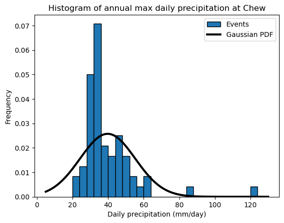
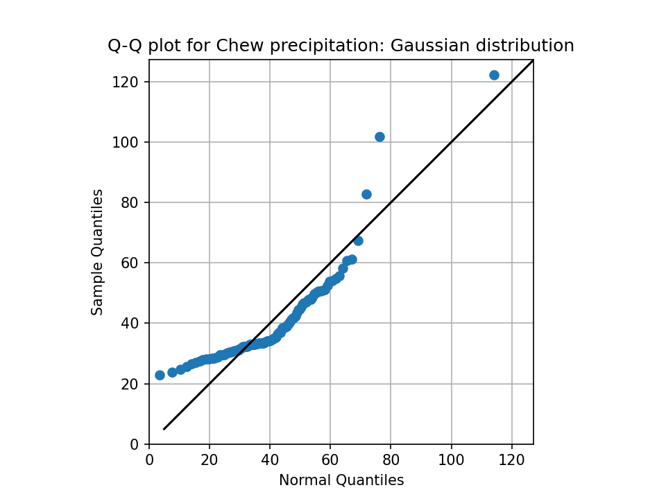
Q: describe qualitatively how well (or how poorly) the Gaussian distribution fits the data. Is there a tendency to underestimate the occurence of some values? Or overestimate others?
Bonus excercise (optional): a good way to check if a distribution matches the data well is to generate a Q-Q plot. We are not in a statistics class and therefore I won’t delve into the details here - but if you are adventurous, visit climatematch for some context, and code your own Q-Q plot below!
# Your answer here
Fitting the GEV#
Okay, so we agree that the Gaussian distribution is not an accurate representation of our data. This is because the Gaussian distribution is determined by only two parameters (the mean and the standard deviation) and is symmetric around its central value. However, extreme value histograms often exhibit a “thick tail” formed by rare, extreme events. Fortunately, other distributions can better capture these characteristics. Let’s explore the generalized extreme value (GEV) distribution.
The GEV distribution introduces a third parameter. The location and scale parameters behave similarly to the mean and standard deviation in a normal distribution. However, the shape parameter impacts the tails of the distribution, making them either thinner or thicker. Since extreme event distributions often exhibit thick tails, they are typically better represented by the GEV distribution.
To estimate the parameters of the GEV distribution, we use the stats.genextreme() function from the scipy package. The three GEV parameters (location, scale, and shape) can be estimated from data using the gev.fit() method. The second argument in gev.fit(), shown in the example below, is optional (it provides an initial guess for the shape parameter). In some cases, setting this to zero is beneficial, as the fitting algorithm can be unstable and may return incorrect values otherwise. (Hint: Always check if your results make sense!)
shape, loc, scale = stats.genextreme.fit(annual_max, 0)
shape, loc, scale
(np.float64(-0.23225674247576752),
 np.float64(33.027555097979146),
 np.float64(7.581093532587792))
Now let’s see if the GEV fits our data better:
bins = np.arange(20, 130, 4)

annual_max.plot.hist(edgecolor='k', bins=bins, density=True, label='Events');
plt.title('Histogram of annual max daily precipitation at Chew');
plt.xlabel('Daily precipitation (mm/day)');

# add Gaussian PDF
x_pdf = np.arange(5, 130, 0.1)
y_pdf = stats.norm.pdf(x_pdf, mean, std_dev)
plt.plot(x_pdf, y_pdf, c="k", lw=3, label='Gaussian PDF');

# add GEV PDF
x_pdf = np.arange(5, 130, 0.1)
y_pdf = stats.genextreme.pdf(x_pdf, shape, loc=loc, scale=scale)
plt.plot(x_pdf, y_pdf, c="C3", lw=3, label='GEV PDF');

plt.legend();
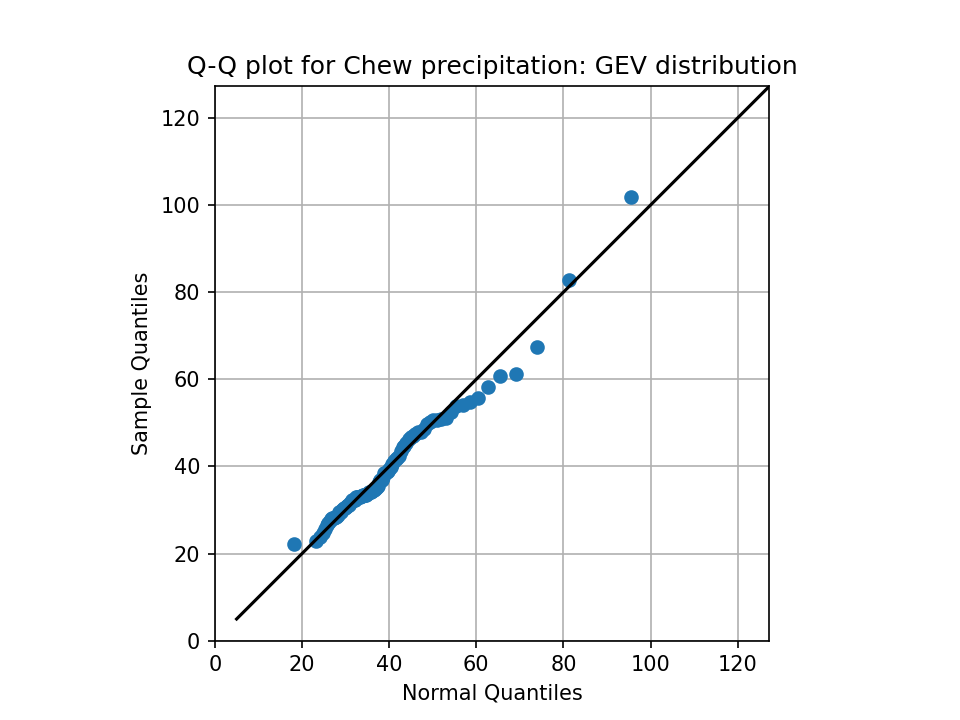
Q: Describe (qualitatively) how the GEV matches the data. Now look closely at the more extreme values in the range - do you see an improvement here as well?
E: in a separate graph, try various values for the shape, location and scale parameters, and see how it influences the distribution. Hint: you can get some inspiration from climatematch.
Bonus exercise: if you did the qq plot exercise above, repeat it here. Does it look better?
Solution: Q-Q plot
# Your answer here
Computing return periods with the GEV#
Now we have a mathematical representation of the distribution of our extreme values. Unlike our previous computations on a discrete sample of values, we can now use SciPy to compute return levels and return periods for any event using a continuous distribution.
stats.genextreme.cdf()gives us the cumulative distribution function (CDF) for a given value.stats.genextreme.ppf()provides the inverse of the CDF (also called the percent point function, PPF).
These may sound like complex terms, but they represent simple concepts that are best understood through examples.
Last week and in the lectures, we learned that the probability of exceedance is simply:
where \(F(x)\) is the CDF.
For example, to compute the probability of exceedance for a return level of 50 mm/day, we can use:
x = 50  # chosen return level in mm/day
p = 1 - stats.genextreme.cdf(x, shape, loc=loc, scale=scale)  # Between 0 and 1. Multiply by 100 for %
f'The probability of exceedance for a return level of {x} mm/day is {p * 100:.1f}%'
'The probability of exceedance for a return level of 50 mm/day is 15.2%'
E: repeat the computation for other return levels, for example 100, 120, 150.
# Your answer here

a = [2, 3, 4, 5]
def my_mean(x):
    print(x)
    return np.sum(x) / len(x)
my_mean(a)
[2, 3, 4, 5]
np.float64(3.5)
Once again, the probabilities become very small for very high return levels (hence very rare events). As a reminder, the return period is simply:
where:
\(T\) is the return period (in years, if annual maxima are used),
\(P(X \geq x)\) is the probability of exceedance, i.e., the probability that an event of magnitude ( x ) or greater will occur.
Since the probability of exceedance is given by \(P(X \geq x) = 1 - F(x)\) where \(F(x)\) is the cumulative distribution function (CDF), we can rewrite the return period as:
Or, in python:
x = 50  # chosen return level in mm/day
p = 1 - stats.genextreme.cdf(x, shape, loc=loc, scale=scale)
t = 1 / p
f'The return period for a return level of {x} mm/day is {t:.0f} years'
'The return period for a return level of 50 mm/day is 7 years'
E: what is the return period for the 1968 event of 122.2 mm/day, based on our fitted GEV? How does it compare with the empirical return period we computed earlier? Which do you think is more plausible?
# Your answer here
We have now learned how to compute return periods for a given level. But what about the inverse, i.e. computing a return level from a chosen return period?
This is where the percent point function (PPF) comes into play. The PPF is the inverse of the cumulative distribution function (CDF) and allows us to determine the return value \(x\) associated with a given probability.
Since the return period is defined as:
we can solve for \(x\) by inverting the CDF:
where:
\(x\) is the return level for a given return period \(T\),
\(F^{-1}\) is the inverse CDF (also called the PPF),
\(T\) is the return period (e.g., 100 years for a 100-year event).
Or, in python:
t = 100  # chosen return period in years
x = stats.genextreme.ppf(1 - 1/t, shape, loc=loc, scale=scale)  # Return value
f'The return value for an {100}-year event is {x:.1f} mm/day'
'The return value for an 100-year event is 95.4 mm/day'
E: check that the return period for an event of 122.2 mm/day is what you expect from your calculations above. Try a few other return periods as you see fit. What is the return level of a 1000-year event?
# Your answer here
E: by noting that in all the simple code snippets above, stats.genextreme can be replaced by stats.norm (for the gaussian distribution), compute the return period of a 122.2 mm/day event with a gaussian distribution. What do you think about this value?
# Your answer here
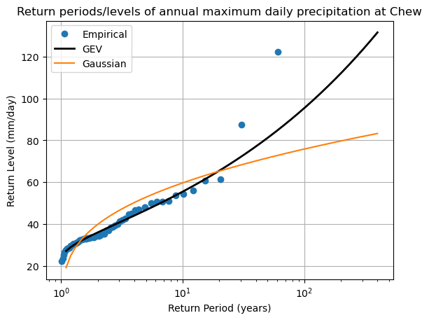
A graphical summary#
Let’s summarize all the computations above in a single plot:
fig, ax = plt.subplots()

# Empirical  statistics
edf = return_period(annual_max)
ax.plot(edf['period'], edf['sorted'], "o", label='Empirical')

# create array of years
years = np.arange(1.1, 400, 0.1)

# GEV return values for these years
ax.plot(years, stats.genextreme.ppf(1 - 1 / years, shape, loc=loc, scale=scale), lw=2, c='k', label='GEV')

# Gaussian return values for these years
ax.plot(years, stats.norm.ppf(1 - 1 / years, mean, std_dev), c='C1', label='Gaussian')

ax.grid(True)
ax.set_title('Return periods/levels of annual maximum daily precipitation at Chew')
ax.set_xlabel("Return Period (years)")
ax.set_ylabel("Return Level (mm/day)")
ax.set_xscale("log"); # ax.set_yscale("log");
plt.legend();
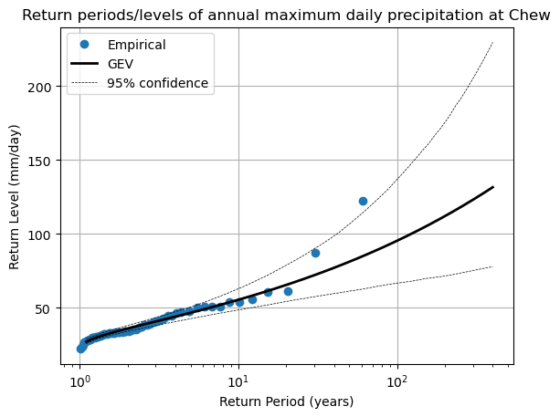
Going further: confidence intervals on the fitted GEV#
We can apply the same bootstrapping methods to obtain the uncertainty (or confidence intervals) of our fitted GEV parameters. It works the same way as with the empirical return values: we resample the data many times, and fit our GEV parameters anew at each iteration. Let’s go:
# Bootstrap resampling
n_boot = 1000
returns_boot = pd.DataFrame(np.zeros((len(years), n_boot)), index=years) # Store bootstrap GEV outcomes
for i in range(n_boot):
    # Create a fake sample, with some years removed or pulled twice, but always of the same length
    sample = annual_max.sample(n=len(annual_max), replace=True)
    # Fit the GEV
    params = stats.genextreme.fit(sample, 0)
    # Store the data
    returns_boot[i] = stats.genextreme.ppf(1 - 1 / years, *params)
fig, ax = plt.subplots()

# Empirical  statistics
edf = return_period(annual_max)
ax.plot(edf['period'], edf['sorted'], "o", label='Empirical')

# create array of years
years = np.arange(1.1, 400, 0.1)

# GEV return values for these years
ax.plot(years, stats.genextreme.ppf(1 - 1 / years, shape, loc=loc, scale=scale), lw=2, c='k', label='GEV')

# Add confidence interval
ax.plot(years, returns_boot.quantile(0.05, axis=1), lw=0.5, c='k', ls='--', label='95% confidence')
ax.plot(years, returns_boot.quantile(0.95, axis=1), lw=0.5, c='k', ls='--')

ax.grid(True)
ax.set_title('Return periods/levels of annual maximum daily precipitation at Chew')
ax.set_xlabel("Return Period (years)")
ax.set_ylabel("Return Level (mm/day)")
ax.set_xscale("log"); # ax.set_yscale("log");
plt.legend();
Conclusion#
In this lesson, we’ve explored the process of modeling extreme events using both empirical methods and the Generalized Extreme Value (GEV) distribution. By fitting the GEV distribution to our data, we’ve gained a more nuanced understanding of return periods and return levels, which are essential for predicting the likelihood of future extreme events.
Key Takeaways:
Empirical return periods, while straightforward, may not provide accurate estimates for rare events, especially with limited data.
The GEV distribution offers a comprehensive framework for modeling extremes, accommodating various types of tail behaviors.
The reliability of your models heavily depends on the quality and length of your data records.