Lesson: timeseries analysis and extreme values#
Over the past two weeks, you’ve learned how to work with NetCDF files, exploring their complex multidimensional structures, plotting global maps, and summarizing climate projection datasets. Today, we’re shifting gears slightly. Instead of working with gridded data, we’ll (temporarily) return to something more familiar perhaps: time series in tabular form. While this may seem simpler at first, handling time series data comes with its own set of challenges!
To get started, let’s import the libraries we’ll be using. This week, we’re introducing two key newcomers:
pandas, replacing xarray for now: pandas is the backbone of data analysis in Python. It actually predates xarray and serves as the foundation for many of its core functions. If you’ve grown comfortable with xarray, you’ll likely find pandas’ syntax quite familiar.
SciPy: the Swiss Army knife of statistical analysis in Python. Whether you’re performing interpolation, fitting models, or conducting statistical tests, SciPy is an essential tool for scientific computing.
Copyright notice: parts of this class is inpired by the excellent climatematch tutorials. I really recommend you to check them out!
import numpy as np
import matplotlib.pyplot as plt
import pandas as pd  # This is new
from scipy import stats  # This also
Daily meteorological observations at Heathrow#
Go to the download page. Download the Heathrow meteorological data and put it in your data folder. To keep things clean, I decided to put mine in a csv folder within data. “CSV” stands for comma-separated values, and I’m sure you already heard of it? If not, a quick web search is in order.
The gsod-heathrow.csv data file is a text file I downloaded from the “Global Surface Summary of the Day” database, managed by NOAA. Since we can’t trust the current US adminstration to keep this infrastructure running for the duration of the class, I mirrored the GSOD readme on our server - you’ll find it here.
Let’s open the file and display its content:
dfh = pd.read_csv('../data/csv/gsod-heathrow.csv',  # Read the CSV file using Pandas
                  index_col=1,  # what's this doing?
                  parse_dates=True  # and this?
                 )
dfh
| STATION | DEWP | FRSHTT | GUST | MAX | MIN | MXSPD | PRCP | SLP | SNDP | STP | TEMP | VISIB | WDSP | |
|---|---|---|---|---|---|---|---|---|---|---|---|---|---|---|
| DATE | ||||||||||||||
| 1948-12-01 | 3772099999 | 37.2 | 0 | 999.9 | 44.4 | 33.4 | 8.9 | 0.00 | 9999.9 | 999.9 | 999.9 | 37.6 | 0.0 | 3.4 |
| 1948-12-02 | 3772099999 | 44.5 | 0 | 999.9 | 53.4 | 40.3 | 19.0 | 0.00 | 9999.9 | 999.9 | 999.9 | 48.6 | 0.0 | 11.4 |
| 1948-12-03 | 3772099999 | 50.9 | 0 | 999.9 | 56.3 | 51.3 | 15.9 | 0.00 | 9999.9 | 999.9 | 999.9 | 54.1 | 0.0 | 11.5 |
| 1948-12-04 | 3772099999 | 43.1 | 0 | 999.9 | 51.3 | 35.4 | 14.0 | 0.00 | 9999.9 | 999.9 | 999.9 | 46.7 | 0.0 | 6.4 |
| 1948-12-05 | 3772099999 | 39.2 | 0 | 999.9 | 48.4 | 33.4 | 19.0 | 0.00 | 9999.9 | 999.9 | 999.9 | 43.0 | 0.0 | 10.5 |
| ... | ... | ... | ... | ... | ... | ... | ... | ... | ... | ... | ... | ... | ... | ... |
| 2025-02-01 | 3772099999 | 37.4 | 0 | 13.2 | 42.8 | 32.0 | 8.4 | 0.00 | 1028.9 | 999.9 | 25.8 | 40.6 | 23.7 | 5.9 |
| 2025-02-02 | 3772099999 | 32.6 | 0 | 999.9 | 47.7 | 28.4 | 8.0 | 0.00 | 9999.9 | 999.9 | 999.9 | 37.3 | 5.8 | 5.0 |
| 2025-02-03 | 3772099999 | 37.4 | 10000 | 18.1 | 47.3 | 30.2 | 9.9 | 0.01 | 9999.9 | 999.9 | 999.9 | 40.1 | 5.8 | 5.8 |
| 2025-02-04 | 3772099999 | 42.5 | 110000 | 21.0 | 50.2 | 38.1 | 14.0 | 0.01 | 9999.9 | 999.9 | 999.9 | 46.2 | 6.1 | 8.7 |
| 2025-02-05 | 3772099999 | 37.4 | 0 | 999.9 | 49.8 | 35.6 | 11.1 | 0.00 | 9999.9 | 999.9 | 999.9 | 43.3 | 6.7 | 4.9 |
22697 rows × 14 columns
Like xarray objects, pandas objects are tailored for data exploration. In xarray, we manipulated objects called “Datasets” and “DataArrays”. In pandas, the equivalents are “Dataframes” and “Series”:
type(dfh)
pandas.core.frame.DataFrame
type(dfh['TEMP'])
pandas.core.series.Series
dfh['TEMP']
DATE
1948-12-01    37.6
1948-12-02    48.6
1948-12-03    54.1
1948-12-04    46.7
1948-12-05    43.0
              ...
2025-02-01    40.6
2025-02-02    37.3
2025-02-03    40.1
2025-02-04    46.2
2025-02-05    43.3
Name: TEMP, Length: 22697, dtype: float64
All “Series” in a “Dataframe” share the same coordinate, the “index”:
dfh.index
DatetimeIndex(['1948-12-01', '1948-12-02', '1948-12-03', '1948-12-04',
               '1948-12-05', '1948-12-06', '1948-12-07', '1948-12-08',
               '1948-12-09', '1948-12-10',
               ...
               '2025-01-27', '2025-01-28', '2025-01-29', '2025-01-30',
               '2025-01-31', '2025-02-01', '2025-02-02', '2025-02-03',
               '2025-02-04', '2025-02-05'],
              dtype='datetime64[ns]', name='DATE', length=22697, freq=None)
Let’s plot the data:
dfh['TEMP'].plot();
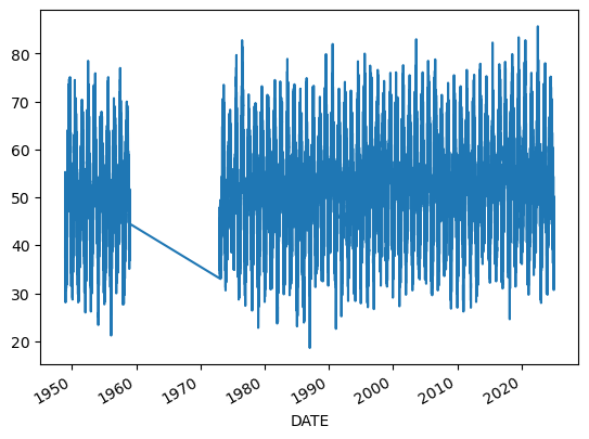
Q: spend some time exploring the dataset. Plot one or two variables, including MAX and PRCP. What can you notice?
# Your answer here
Welcome to the messy world of real-world observations! Historical data is always incomplete or imperfect, and we have to deal with it. This file, by the way, is considerably easier to deal with and has much less missing data than the Bristol or Cardiff stations data.
This is an unfortunate bit of working with in-situ observations and non-model data: they always need a bit of “cleaning”, and I won’t lie: it’s the boring bit and we have to go through it.
Data preparation#
Missing values#
Let’s start by noting that the README mentions missing values. GSOD chose to replace them with specific numbers, which are messing with our plots and statistics. Let’s replace these with np.nan, which is short for “Not a Number”:
dfh = dfh.replace([99.99, 999.9, 9999.9], np.nan)
Q: compare your new plot of MAX and PRCP with the ones you’ve plotted above. Notice the difference?
Note that while the missing values are not messing with the plot anymore, they are still missing. Somewhere in the plot, there are “holes”. We can actually count missing values each year with a simple trick:
(dfh['PRCP'].isnull().resample('YS').mean() * 100).plot();  # We'll explain this below

plt.title('Missing values per calendar year for the variable PRCP');
plt.ylabel('Missing values (%)');
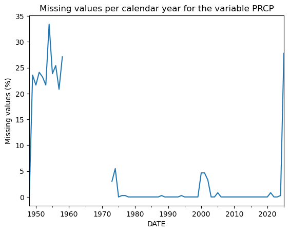
OK - let’s take a step back and see what we’ve done.
Q: step by step, decompose the one-liner above. First, check what dfh['PRCP'].isnull() does. Then remember when you’ve see .resample() last time, and note that it works exactly the same!
# Your answer here
The final trick is to note that averaging booleans (”False” and “True”) is just averaging 0s and 1s:
np.mean([False, True, False])
np.float64(0.3333333333333333)
If the above is not clear yet, please ask!
Now, let’s analyse the plot. We have about 30% of missing PRCP data in the first year of the series, followed by a blank period in the 1960s. To complicate the matter a bit, it turns out that in that period we have no data at all: no timestamps, and no measurements. This is actually hiding the fact that we have 100% data missing here!
One more step of data preparation is to notice that we expect a certain format for these files. Since we know the frequency of the measurements (daily) as well as the start and end dates, we can use pandas to create a timestamp index of the length (in days) of the full time period:
full_dates = pd.date_range(dfh.index[0],  # Initial date
                           dfh.index[-1],  # Last date
                           freq='D'  # Frequency (daily)
                          )

len(dfh), len(full_dates)  # Compare the lengths
(22697, 27826)
We see that we are missing approx. 5000 records in the Dataframe. Fortunately, it’s fairly easy to format the data appropriately:
dfh = dfh.reindex(full_dates)
Let’s reevaluate our missing values plot from before:
(dfh['PRCP'].isnull().resample('YS').mean() * 100).plot();  # We'll explain this below

plt.title('Missing values per calendar year for the variable PRCP');
plt.ylabel('Missing values (%)');
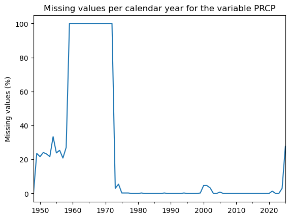
That’s more like it. For over a decade, 100% of the data is missing. This makes the record a bit useless before 1973. Also, since 2025 is not complete yet, we might as well get rid of it!
We now select the time period we’ll focus on for further analysis:
dfh = dfh.loc['1973':'2024']
Outliers / artifacts#
Now, we’re done! Or, are we really? Let’s have a final look at precipitation:
dfh['PRCP'].plot();
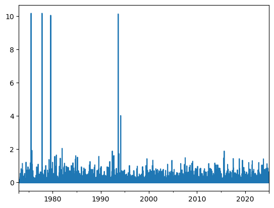
(dfh['PRCP'] > 10).sum()
np.int64(4)
Mh, there are 4 days with over 10 inches (254 millimeters) of recorded rain in 24 hours. While this is not strictly impossible, these values would crush many confirmed UK record precipitation at weather stations (which are around 50-60 mm daily rain) and would represent more than a quarter of the annual rain in a single day. While I can’ be 100% sure, I’m quite confifent that this represent true outliers and should be removed.
Let’s do that:
dfh['PRCP'] = dfh['PRCP'].where(dfh['PRCP'] < 10)  # Replace values above 10 inches with NaN

dfh['PRCP'].plot();
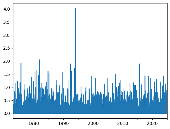
This just looks more plausible now. The remaining most visible extreme value (4 inches, i.e. ~ 100 mm in a day) is still very high but more plausible. It happened on 1994-02-24, and might or might not be correct:
dfh['PRCP'].max(), dfh['PRCP'].idxmax()
(np.float64(4.02), Timestamp('1994-02-24 00:00:00'))
Units#
The README tells us the units of our variables. They are (horror!) in US units. Fortunately, it is easy to convert)
dfh['TEMP_c'] = (dfh['TEMP'] - 32) * 5/9
dfh['TEMP_c'].plot();
Good job! Now we’re ready to move forward with the analysis. 🚀
- Identify missing values – Are there gaps in the data? How much is missing?
- Check time consistency – For fixed-frequency data (like daily temperature records), ensure no missing timestamps.
- Handle missing values – Decide whether to fill gaps (e.g., interpolation) or replace incomplete data with nans (not-a-number, recommended).
- Choose a study period – Select the timeframe relevant to your research.
- Detect and remove outliers – Are there extreme values that don't make sense? (e.g., negative or extreme rainfall)
Data exploration and descriptive statistics#
Let’s repeat the data preparation steps in a single cell to make sure we are on the same page:
# Read the data
dfh = pd.read_csv('../data/csv/gsod-heathrow.csv', index_col=1, parse_dates=True)

# Missing values
dfh = dfh.replace([99.99, 999.9, 9999.9], np.nan)
dfh = dfh.reindex(pd.date_range(dfh.index[0], dfh.index[-1], freq='D'))

# Period selection
dfh = dfh.loc['1973':'2024']

# Outlier filtering
dfh['PRCP'] = dfh['PRCP'].where(dfh['PRCP'] < 10)

# Keep the variables we want
dfh = dfh[['TEMP', 'MAX', 'MIN', 'PRCP']].copy()

# Convert units
dfh[['TEMP', 'MAX', 'MIN']] = (dfh[['TEMP', 'MAX', 'MIN']] - 32) * 5/9
dfh['PRCP'] = dfh['PRCP'] * 25.4
dfh
| TEMP | MAX | MIN | PRCP | |
|---|---|---|---|---|
| 1973-01-01 | 0.611111 | 3.000000 | -3.000000 | 0.000 |
| 1973-01-02 | 3.055556 | 7.000000 | -1.000000 | 0.254 |
| 1973-01-03 | 8.055556 | 10.000000 | 4.000000 | 0.000 |
| 1973-01-04 | 8.888889 | 11.000000 | 7.000000 | 0.000 |
| 1973-01-05 | 6.111111 | 9.000000 | 3.000000 | 0.000 |
| ... | ... | ... | ... | ... |
| 2024-12-27 | 5.777778 | 6.388889 | 5.000000 | 0.000 |
| 2024-12-28 | 4.722222 | 6.111111 | 3.611111 | 0.000 |
| 2024-12-29 | 5.055556 | 9.000000 | 2.722222 | 0.254 |
| 2024-12-30 | 8.277778 | 9.000000 | 6.888889 | 0.000 |
| 2024-12-31 | 10.166667 | 12.111111 | 6.500000 | 0.000 |
18993 rows × 4 columns
Descriptive statistics#
Like xarray, pandas allows to compute simple statics, such as the average temperature and standard deviation of daily temperature:
mean = dfh['TEMP'].mean()
avg = dfh['TEMP'].std()

f"The temp average is {mean:.2f}°C and the daily standard deviation is {avg:.2f}°C"
'The temp average is 11.31°C and the daily standard deviation is 5.58°C'
It also allows to compute the quantiles of the data:
median = dfh['TEMP'].median()
q75 = dfh['TEMP'].quantile(0.75)
q25 = dfh['TEMP'].quantile(0.25)

f"The temp median is {median:.2f}°C and the interquartile range is [{q25:.2f}-{q75:.2f}]°C"
'The temp median is 11.22°C and the interquartile range is [7.17-15.67]°C'
E: compute the mean, median, and 10 and 90% quantiles of daily precipitation.
# Your answer here
Period selection#
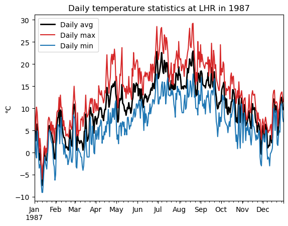
It’s equally easy to select only parts of the index. For example, to plot the daily temperatures over the year 1987:
dfh_87 = dfh.loc['1987'] # Similar to ".sel()" in xarray
dfh_87['TEMP'].plot(color='k', linewidth=2, label='Daily avg')
dfh_87['MAX'].plot(color='C3', label='Daily max')
dfh_87['MIN'].plot(color='C0', label='Daily min')
plt.legend(); plt.title('Daily temperature statistics at LHR in 1987'); plt.ylabel('°C');
E: Now repeat the plot with the year 2022 (the hottest day on record), and zoom in the months of June to September 2022. Hint: to select a time period, you will need to use .loc[date1:date2]
# Your answer here
Temporal aggregation: resampling#
Like xarray, pandas allows to compute statistics for sepcific time average. For example monthly:
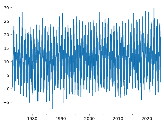
dfh.resample('MS').mean()['TEMP'].plot();
Or annual:
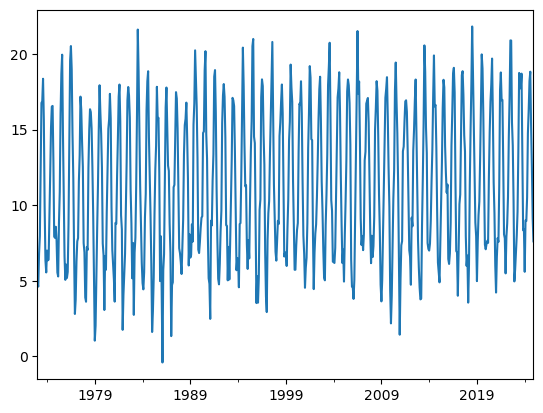
dfh.resample('YS').mean()['TEMP'].plot();
E: compute the difference between the average temperature over the last decade (2015-2024) and the first decade in the record (1973-1982). Repeat with maximum, minimum temperature and precipitation. (Hint: you can avoid repetition by noticing that one can do statistics on entire dataframes.
Q: Did the maximum or mean temperatures change more during the two period? Was it on average wetter or drier over the past decade?
# Your answer here
Temporal aggregation: rolling window#
“Rolling window” statistics is another way to compute temporal averages. As the name suggests, for each timestamp, statistics are computed over a window before or centered on that timestamp.
Let’s compute, for example, the decadal average of temperature change over the annual timeseries:
at.rolling(11, center=True).mean()
---------------------------------------------------------------------------
NameError                                 Traceback (most recent call last)
Cell In[34], line 1
----> 1 at.rolling(11, center=True).mean()

NameError: name 'at' is not defined
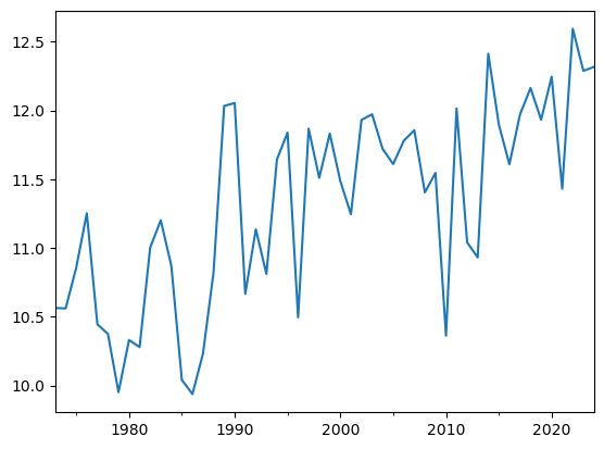
at = dfh['TEMP'].resample('YS').mean()
roll = at.rolling(11, center=True).mean()

at.plot(c='k', label='Annual temperature');
roll.plot(c='C0', linewidth=3, label='11-year rolling mean');
plt.legend();
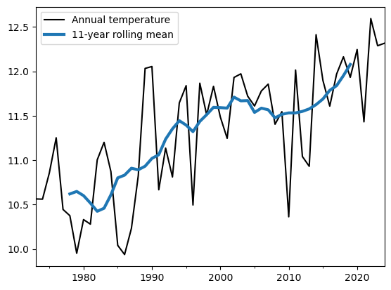
Q: interpret the plot. Why do you think the rolling timeseries are not covering the full period? Now repet the plot without the center=True argument.
# Your answer here
Selection by condition#
You may find it useful to select parts of the data only, for example all August days, or all days above 0 mm precipitation. This is done with comparison operators (e.g. ==, >, <=, etc.).
For example, let’s select all days where precip is non zero:
dfhp = dfh.loc[dfh['PRCP'] > 0]
Q: do you understand what dfh['PRCP'] > 0 is doing? Perhaps it’s worth exploring it step by step, for example by printing the output of dfh['PRCP'], then remember what > does.
# Your answer here
E: count the number of rainy days at Heathrow. Compute the ratio of rainy days over all days. Now repeat with heavy rain days, with more than > 10 mm precipitation per day. What’s the ratio of heavy rain days over all rainy days?
# Your answer here
We can use the same strategy to pick days withing a given month:
dfh_aug = dfh.loc[dfh.index.month == 8]
Q: do you understand what dfh.index.month == 8 is doing? Perhaps it’s worth exploring it step by step, for example by printing the output of dfh.index.month, then remember what == does.
# Your answer here
E: OK, now compute the average daily temperature in August. Repeat for the month of January.
# Your answer here
Bonus: selection for multiple months:
dfh_jja = dfh.loc[(dfh.index.month == 6) | (dfh.index.month == 7) | (dfh.index.month == 8)]  # OK
dfh_jja = dfh.loc[dfh.index.month.isin([6, 7, 8])]  # better
Selection by category: Groupby#
What we’ve done with two months above can be generalized for all various categories. For example, it is possible to compute summary statistics organised by monthss:
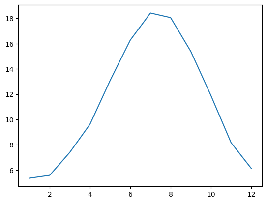
dfhm = dfh.groupby(dfh.index.month).mean()
dfhm['TEMP'].plot();
Q: do you understand what dfh.groupby(dfh.index.month) is doing? Perhaps it’s worth exploring it step by step, for example by printing the output of dfh.index.month, then remember what groupby does, and what .mean() does.
# Your answer here
Q: check that the monthly averages for January and August you computed above match the plot.
E: now plot (and interpret) the monthly average precipitation chart (instead of temperature):
# Your answer here
Groupby is very useful. We could also group by rain categories, but this is perhaps for another time. We can however easily adapt “groupby” to use days instead of months:
dfhd = dfh.groupby(dfh.index.dayofyear)  # We have only grouped! No statistics yet

dfhd['TEMP'].mean().plot(color='k');
dfhd['MAX'].mean().plot(color='C3');
dfhd['MAX'].max().plot(style='+', color='C3', alpha=0.5);
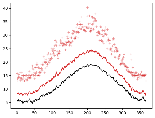
E: Add proper labels to the curves above. Do you understand what’s plotted there? Now also add the equivalent for the MIN temperatures. Hint: the goal is to reproduce a plot similar to the Meteoblue climate diagrams.
# Your answer here
Histograms#
Let’s start by selecting all daily values in the month of July:
dfh_jul = dfh.loc[dfh.index.month == 7]
These represent 1612 values altogether. We are talking about a statistical sample of a population. The histogram of this sample can be plotted with pandas easily, here with the example TEMP:
sample = dfh_jul['TEMP']
sample.plot.hist(edgecolor='k');
plt.title('Histogram of daily temperature in July');
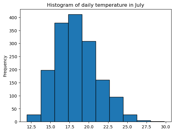
The Y axis represents the number of events by bins in the sample (“frequency” is a bit misleading). Usually we like to work in density (percentages).
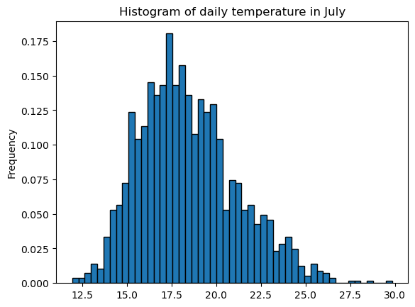
Pandas decides on the bins automatically. It’s possible to impose a number of bins, or bin size, or bin ranges:
sample.plot.hist(edgecolor='k', density=True, bins=51);
plt.title('Histogram of daily temperature in July');
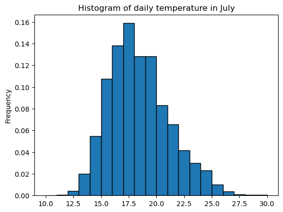
sample.plot.hist(edgecolor='k', density=True,
                 bins=np.arange(10, 31, 1));  # Note: this implies you know the range of values you want to cover
plt.title('Histogram of daily temperature in July');
The histogram values can also be computed for further analysis instead of plotting:
# Compute histogram values (raw counts)
bins = np.arange(10, 31, 2)
hist_values, bin_edges = np.histogram(sample, bins=bins)
E: Explore the hist_values and bin_edges variables. Can you understand what is done?
# Your answer here
E: repeat the analysis for precipitation, first by letting pandas decide on the bins, then by defining bins yourself starting at 0 mm up to 45 mm (plot A). Now do another plot (plot B) where bins start at 1 mm instead of 0 mm. Discuss the differences in the plot.
# Your answer here
Probability density functions#
A population can be approximated mathematically with probabilty density functions (PDFs). The most common one is the gaussian PDF, which is defined by only two parameters, the mean and standard deviation.
mean_temp = sample.mean()
std_temp = sample.std()

ax = sample.plot.hist(edgecolor='k', density=True, bins=np.arange(10, 31, 1));
plt.title('Histogram of daily temperature in July');

# add in vertical line at mean
ylim = ax.get_ylim()
ax.vlines(mean_temp, ymin=ylim[0], ymax=ylim[1], color="C3", lw=3, label="mean")

# add PDF
x_pdf = np.arange(7, 31, 0.1)
y_pdf = stats.norm.pdf(x_pdf, mean_temp, std_temp)
ax.plot(x_pdf, y_pdf, c="k", lw=3, label='Gaussian PDF');
plt.legend();
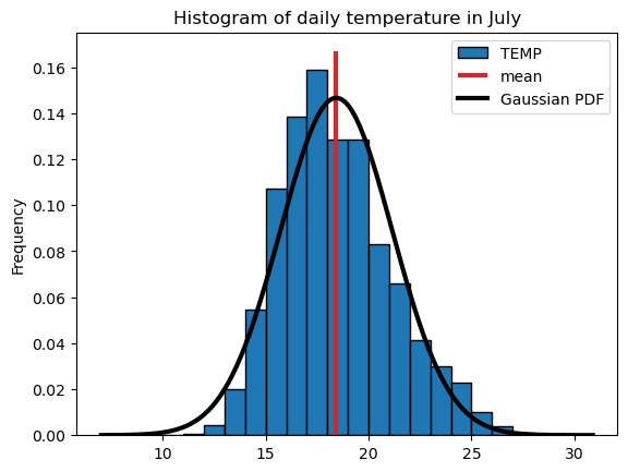
The gaussian PDF approximate the data quite well, but there are also quite some deviations from the Gaussian. Can you spot them?
Now is the time to refresh your knowledge about normality tests and Q-Q plots. I wont cover the fundamentals here, (we’re not that much interested in this topic here), but the Climatematch tutorials offer excellent code examples and explanations: climatematch Extremes and Variability.
For now, let’s assume that a Gaussian is a good approximation of our population. From the histogram and the PDF, we can compute the probability of occurrence of a certain even. For example, the probability of a day to be hotter than 25°C on average.
The empirical probability this event is simply given by the data. We count the number of events and evaluate their occurence in the past:
n_events = np.sum(sample > 25)   # Equivalent: len(sample.loc[sample > 25])
n_sample = len(sample)
f'Empirical probability of daily avg temperature > 25°C: {n_events / (n_sample + 1) * 100:.1f}%'
'Empirical probability of daily avg temperature > 25°C: 1.5%'
Note that we used (n + 1) to compute the probability. The reason for this will be explained below. For the theoretical probability based on the approximated (fitted) Gaussian distribution, we have to refer to the cumulative PDF. Remember?
cum_y_pdf = np.cumsum(y_pdf) / np.sum(y_pdf)
plt.plot(x_pdf, cum_y_pdf, c="k", lw=3, label='Gaussian cumulative PDF');
plt.legend(); plt.grid();
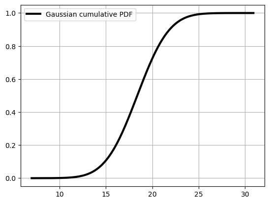
The probability of exceedance is 1 - the value of the cumulative PDF at 25°C. Can you try to see it from the plot? It’s quite hard for small probabilities isn’t it? Therefore, scipy gives us a way to compute it with cenrtainty:
prob_exceedance = 1 - stats.norm.cdf(25, loc=mean_temp, scale=std_temp)
f'Theoretical probability of daily avg temperature > 25°C: {prob_exceedance * 100:.1f}%'
'Theoretical probability of daily avg temperature > 25°C: 0.8%'
Q: discuss the differences between the empirical and theoretical probability of exceedance by looking at the histogram plot overlaid with the PDF. Does this make sense to you?
# Your answer here
Empirical return levels#
Let’s continue our exploration of extreme events. We could for example have a look at the maximum recorded temperature each year.
We can use resample for this:
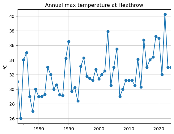
maxt = dfh['MAX'].resample('YS').max()  # .max() is the important bit here!
maxt.plot(style='-o');
plt.grid(); plt.title('Annual max temperature at Heathrow'); plt.ylabel('°C');
The sample size is now much smaller! Just the number of years in the time series. It becomes trickier to do stats on this sample:
maxt.plot.hist(edgecolor='k', bins=np.arange(26, 42, 1));
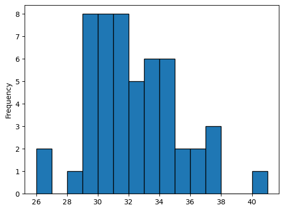
The shape of the ditribution is far from Gaussian. This is a problem we will tackle at another time.
What we are interested here is to compute the probability of a given temperature to occur each year, based on the data only. Intuitively, the probability of annual maximum temperature exceeding 40°C can be computed easily:
prob_over_40 = 1 / len(maxt)
f'The probability of this event is {prob_over_40 * 100:.1f}%'
'The probability of this event is 1.9%'
This is because this event occurred only once in the 52 years of the observational record. In other terms, the empirical return period of this event if 52 years. This is easier to understand than 1.9%, yet it’s exactly the same concept. Mathematically:
\(R = 1 / p\)
or
\(p = 1 / R\)
With R the return period and p the probability of the event.
Now, let’s try to work more systematically on the classification of extreme events. Let’s start by noticing that the year at which an event occurred is irrelevant. What matters is how “extreme” an event it. Therefore, we will work with another organisation of the data. We create a new table, where we will organise the events by their “rank”, from most extreme to least extreme:
# Create an empty dataframe indexed by the number of years
edf = pd.DataFrame(index=np.arange(1, len(maxt)+1))

# Add the sorted temperature data
edf['sorted'] = maxt.sort_values(ascending=False).values  # Careful! Note the use of .values here
E: Explore the edf dataframe. What is the maximum temperature? What is the smallest maximum temperature?
E: note that we used .values here to assign the values from one dataframe to the other. That’s because pandas wants to align indices where possible. Check for example what happens if you remove .values. The role of .values is to use the numpy arrays (the numbers) to fill the edf dataframe, not the combination of index + values.
# Your answer here
Good. Now we can notice that the index of the Dataframe represents the “rank” of the event, from most extreme to least extreme. Let’s verify that events of equal intensity are not given similar ranks. This occurs if we rely on categorical data:
len(edf), len(np.unique(edf['sorted']))
(52, 36)
E: explore edf again. Can you spot the identical values? Can you figure out how this would happen in the data records?
In nature, extreme events are truly unique, but our observational systems and the storage of numbers with computers leads to this effect (discretisation).
OK well, then we have to rank the data differently, since we dont want to assign the same return level with a different rank. Let’s use scipy instead (rankdata):
# rank via scipy instead to deal with duplicate values
edf['ranks'] = np.sort(stats.rankdata(-edf['sorted']))  # Note the "-" to rank from max to min
E: explore edf again. Can you detect what the ranking function did to the data?
Let’s make sure we have the same number of unique ranks as unique values:
len(np.unique(edf['sorted'])), len(np.unique(edf['ranks']))
(36, 36)
OK all good now.
Next, we compute the empirical probability of exceedance by dividing the rank (r) by the total number of values (n) plus 1:
Important! This formula is slightly different from the one used earlier — we divide by n+1 instead of n.
Why? Without this adjustment, the probability of exceeding the lowest maximum value (19.05°C) would be 1, meaning the probability of observing a maximum temperature below 19°C in any given year would be zero. This is not realistic.
Adding n+1 accounts for the fact that our dataset is just a sample, and we haven’t observed all possible values in the true population. See also Weibull plotting position.
# find exceedance probability
n = len(edf)
edf["exceedance"] = edf["ranks"] / (n + 1)
E: as an excercise, compute the probability of exceedance by dividing by n instead of n+1, and verify the claim aboce. Does it make sense to use n+1 now?
# Your answer here
Despite this small difference, we can verify that the probability of exceedance of the >40°C event matches our simple calculations from above. Now however, we can compute the probabilities of exceedance (and therefore the return values) of all extreme events in the timeseries. Let’s go:
# compute the return period
edf["period"] = 1 / edf["exceedance"]
E: explore edf again and get aquainted with the new data.
# Your answer here
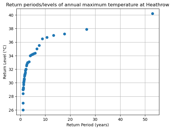
Let’s plot (finally!) our long awaited return level plot:
fig, ax = plt.subplots()
ax.plot(edf['period'], edf['sorted'], "o")
ax.grid(True)
ax.set_title('Return periods/levels of annual maximum temperature at Heathrow')
ax.set_xlabel("Return Period (years)")
ax.set_ylabel("Return Level (°C)")
ax.set_xscale("linear")  # notice the xscale
For readability and ease of use, we often discuss return periods using a logarithmic scale, referring to events with return periods of 1 year, 10 years, and 100 years. Let’s modify the plot above by changing the x-axis to a logarithmic scale.
fig, ax = plt.subplots()
ax.plot(edf['period'], edf['sorted'], "o")
ax.grid(True)
ax.set_title('Return periods/levels of annual maximum temperature at Heathrow (log scale)')
ax.set_xlabel("Return Period (years)")
ax.set_ylabel("Return Level (°C)")
ax.set_xscale("log")  # change the xscale
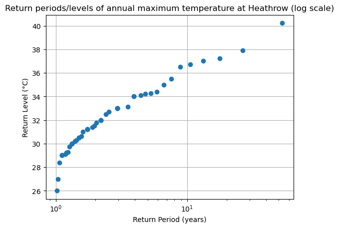
What is the approximative empirical return period of a 34°C max temperature? And of a 38°C max temperature?
# Your answer here
E: now repeat the steps above but with precipitation instead. Compute the return period of a 40 mm/day event.
# Your answer here