Assignment: timeseries analysis and extreme values#
Import the packages. I’ll do this for you:
import numpy as np
import matplotlib.pyplot as plt
import pandas as pd  # This is new
from scipy import stats  # This also
Heathrow dataset#
Open the file a prepare the data the same way we did in the lesson. Let me do this for you as well:
# Read the data
dfh = pd.read_csv('../data/csv/gsod-heathrow.csv', index_col=1, parse_dates=True)

# Missing values
dfh = dfh.replace([99.99, 999.9, 9999.9], np.nan)
dfh = dfh.reindex(pd.date_range(dfh.index[0], dfh.index[-1], freq='D'))

# Period selection
dfh = dfh.loc['1973':'2024']

# Outlier filtering
dfh['PRCP'] = dfh['PRCP'].where(dfh['PRCP'] < 10)

# Keep the variables we want
dfh = dfh[['TEMP', 'MAX', 'MIN', 'PRCP']].copy()

# Convert units
dfh[['TEMP', 'MAX', 'MIN']] = (dfh[['TEMP', 'MAX', 'MIN']] - 32) * 5/9
dfh['PRCP'] = dfh['PRCP'] * 25.4
Now create two samples:
s1is the sample of daily average temperatures in July from 1973-1987 (15 years)s2is the sample of daily average temperatures in July from 2010-2024 (15 years)
Verify that both samples have the same number of days. How many are that?
# Your answer here
Plot an histogram for each of these distributions, using the same bins for boths. If you are a bit ambitious, plot both histograms on the same graph.
# Your answer here
Fit a Gaussian PDF for each of these samples, and plot the two PDFs on a single plot. Hint: you should aim at creating a plot similar to this famous IPCC plot.
Interpret the plot. Are there changes in the central value, in the spread of the distribution?
# Your answer here
E: Compute (i) the empirical and (ii) the theoretical probability based on the PDF for a day to exceed 25°C average temperature in both samples.
# Your answer here
Interpret what you computed. What is the increased risk ratio for hot days (>25°) between both periods? Hint: I’m expecting a statement similar to “Hot days have become x times more likely between period 1 and 2.”
# Your answer here
Sometimes, it’s also cold in the UK. Count the average number of days per year where the daily maximal temperature is below freezing
# Your answer here
How many freezing days were there on average before 2000? And after?
# Your answer here
Precipitation and streamflow at Chew valley#
Go to the download page, and download the catchment daily rainfall (53004_cdr.csv) and gauged daily flow (53004_gdf.csv) from the server. Put the files in your data/csv folder.
Open the files in a text editor of your choice, or in jupyterlab itself. Note the header of the file, and how the data is structured.
Reading these files requires to skip the header (skiprows). We will also ignore the second column in each file, and put the two timeseries (streamflow and precipitation) into one dataframe for simplicity. Let me do all this for you:
df = pd.read_csv('../data/csv/53004_cdr.csv', skiprows=19, index_col=0, parse_dates=True)
df.index.name = 'Date'

df.columns = ['cdr', 'gdf']

# Check that time series is complete
assert len(df) == len(pd.date_range(df.index[0], df.index[-1], freq='D'))
assert df['cdr'].isnull().sum() == 0

# Read streamflow and add it to the dataframe
df_gdf = pd.read_csv('../data/csv/53004_gdf.csv', skiprows=19, index_col=0, parse_dates=True)
df_gdf.columns = ['flow', '-']
df['gdf'] = df_gdf['flow']
Explore the dataset. Read the documentation for the catchment rainfall and the gauged streamflow. What are the units of the two variables?
Let me plot the two datasets over a year for you:
df.loc['2000'].plot();
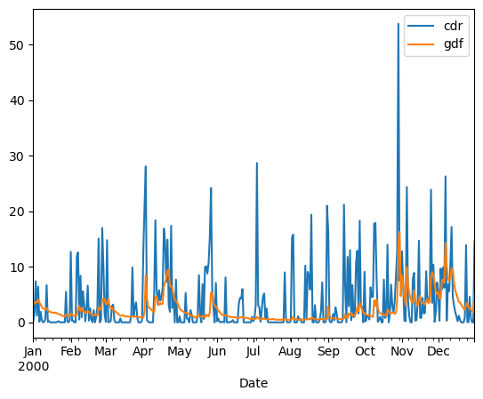
By chance, the two variables have a similar range of values. It is however cleaner to plot them on separate axes:
df.loc['2000'].plot(secondary_y='gdf');

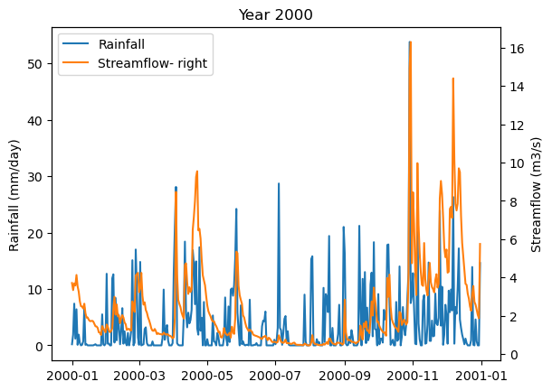
Or, with more control:
f, ax1 = plt.subplots()
ax1.plot(df.loc['2000']['cdr'], label='Rainfall');
ax2 = plt.twinx()
ax2.plot(df.loc['2000']['gdf'], color='C1', label='Streamflow- right');
plt.legend();
ax1.set_ylabel('Rainfall (mm/day)');
ax2.set_ylabel('Streamflow (m3/s)');
plt.title('Year 2000');

# Combine legends
lines, labels = ax1.get_legend_handles_labels()
lines2, labels2 = ax2.get_legend_handles_labels()
ax2.legend(lines + lines2, labels + labels2, loc='best');
Now, instead of plotting the daily rainfall, plot the 5-day rolling mean of the rainfall. Repeat for the year 2012.
# Your answer here
Plot the average daily streamflow and precipitation on one single plot. It’s probably a good idea to smooth the data with a rolling average before grouping for clarity. Hint: the x-axis should show day of year
# Your answer here
Plot the percentage of missing values for both cdr and gdr variable per year over the entire period. Plot both variabls for the time period (2 calendar years) around the period where data is missing.
# Your answer here
With a web search, find out what happened in Chew Magna and Bristol in July 1968 and in the rest of UK later that year.
# Your answer here
Run an empirical return levels analysis for maximal annual daily rainfall at Chew. Your goal is to do a plot similar to the final plot you did in the lesson. For precipitation, it’s a good idea to use log axes on both the x- and y-axis.
# Your answer here
Extend the x-axis range to [1, 1100] using ax.set_xlim([1, 1100]).
Qualitative analysis: based on the plot, visually extrapolate the trend formed by all the points excluding the last two extreme events. Estimate the expected return period for an event exceeding 100 mm, assuming these two events had not occurred.