Introduction to scientific python: numpy and matplotlib#
After a few weeks at learning programming, you may have noticed already that computers are quite good at manipulating numbers. The python language is helping us at it, by providing an interface between us and “the machine”. However, we are going to see that the language needs a little bit of “extra help” to become truly useful for us scientists.
This help comes with the scientific python ecosystem: in the front line, numpy and matplotlib!
I strongly recommend to download this notebook, run the examples yourself and play with it on your computer as you go through this unit (see the explanation video).
Copyright note: many parts of this lesson are taken from the excellent numpy for beginners tutorial.
NumPy#
Why NumPy?#
NumPy (Numerical Python) is an open source Python library that’s used in almost every field of science and engineering. It’s the universal standard for working with numerical data in Python, and it’s at the core of the scientific Python and PyData ecosystems. NumPy users include everyone from beginning coders to experienced researchers doing state-of-the-art scientific and industrial research and development.
The NumPy library contains multidimensional array and matrix data structures (you’ll find more information about this in later sections). It provides ndarray, a homogeneous n-dimensional array object, with methods to efficiently operate on it.
But why do we need arrays?
You remember the following behavior from python lists:
[1, 2] + [1, 2]
[1, 2, 1, 2]
This behavior is useful in certain situations, but most of the time, scientists actually want to realize operations (addition, division, multiplication) element-wise, i.e. element per element. In a nutshell, scientists need the following behavior:
def elementwise_addition(left, right):
    """A pale copy of numpy's addition. Don't do this at home!"""
    output = []
    for l, r in zip(left, right):
        output.append(l + r)
    return output

elementwise_addition([1, 2], [1, 2])
[2, 4]
While it would be possible to use python to redefine all operations on lists in a similar way, it would turn out to be highly inefficient. For reasons which will be explained later, Python is actually quite slow at looping over lists and numbers like this.
This is why NumPy was created. NumPy arrays are faster and more compact than Python lists. An array consumes less memory and is convenient to use. NumPy uses much less memory to store data and it provides a mechanism of specifying the data types. This allows the code to be optimized even further. NumPy efficient calculations with arrays and matrices and it supplies an enormous library of high-level mathematical functions that operate on them.
Installing NumPy#
Make sure you have followed my instructions before going on.
How to import NumPy#
To access NumPy and its functions import it in your Python code like this:
import numpy as np
We shorten the imported name to np for better readability of code using NumPy. This is a widely adopted convention that you should follow so that anyone working with your code can easily understand it.
What is an array?#
An array is a central data structure of the NumPy library. An array is a grid of values: the elements in an array are all of the same type, referred to as the array dtype.
There are many ways to create an array, and one of the simplest is by converting a Python list to a NumPy array:
a = np.array([1, 2, 3, 4, 5, 6])
a
array([1, 2, 3, 4, 5, 6])
An array has attributes describing it and helping us to understand its content. Let’s explore some of them:
# How many elements does the array have
a.size
6
# What kind of elements does the array have
a.dtype
dtype('int64')
# How many dimensions does the array have
a.ndim
1
# And what is its shape
a.shape
(6,)
All these attributes may sound a bit obscure still. Let’s have a look at another example:
a = np.array([[1.3, 2, 3.7, 4], [5, 6.1, 7, 8.5], [9, 10.9, 11, 12.8]])
a
array([[ 1.3,  2. ,  3.7,  4. ],
       [ 5. ,  6.1,  7. ,  8.5],
       [ 9. , 10.9, 11. , 12.8]])
In this example, a is a multidimensional array of two dimensions. Let’s have a look at its attributes:
f"size: {a.size}; dtype: {a.dtype}; ndim: {a.ndim}; shape: {a.shape}"
'size: 12; dtype: float64; ndim: 2; shape: (3, 4)'
The size of this array is 12 (“3 rows” times “4 columns”), its dtype (datatype) is float (the 64 in the name indicates the number of bits - we’ll come back to this point later). The array has 2 dimensions, and its shape is (3, 4), which stands for 3 rows and 4 columns.
You might occasionally hear an array referred to as a “ndarray” which is shorthand for “N-dimensional array”. An N-dimensional array is simply an array with any number of dimensions. You might also hear 1-D, or one-dimensional array, 2-D, or two-dimensional array, and so on. The NumPy ndarray is used to represent both matrices and vectors. A vector is an array with a single dimension (there’s no difference between row and column vectors), while a matrix refers to an array with two dimensions. For 3-D or higher dimensional arrays, the term tensor is also commonly used.
For this week’s class, we will stick with vectors (1-D arrays).
Creating arrays#
Besides creating an array from a sequence of elements (e.g. with a list as done above), you can easily create an array filled with 0’s:
np.zeros(3)
array([0., 0., 0.])
Or with ones:
np.ones(2)
array([1., 1.])
You can create an array with a range of elements:
np.arange(4)
array([0, 1, 2, 3])
And even an array that contains a range of evenly spaced intervals. To do this, you will specify the first number, last number, and the step size:
np.arange(2, 9, 2)
array([2, 4, 6, 8])
You can also use np.linspace() to create an array with values that are spaced linearly in a specified interval:
np.linspace(0, 10, num=5)
array([ 0. , 2.5, 5. , 7.5, 10. ])
While the default data type is floating point (np.float64), you can explicitly specify which data type you want using the dtype keyword:
np.ones(2, dtype=np.int64)
array([1, 1])
Indexing and slicing#
You can index and slice NumPy arrays in the same ways you can slice Python lists.
data = np.array([1, 2, 3])
data[1]
2
data[0:2]
array([1, 2])
data[1:]
array([2, 3])
data[-2:]
array([2, 3])
You can visualize it this way:
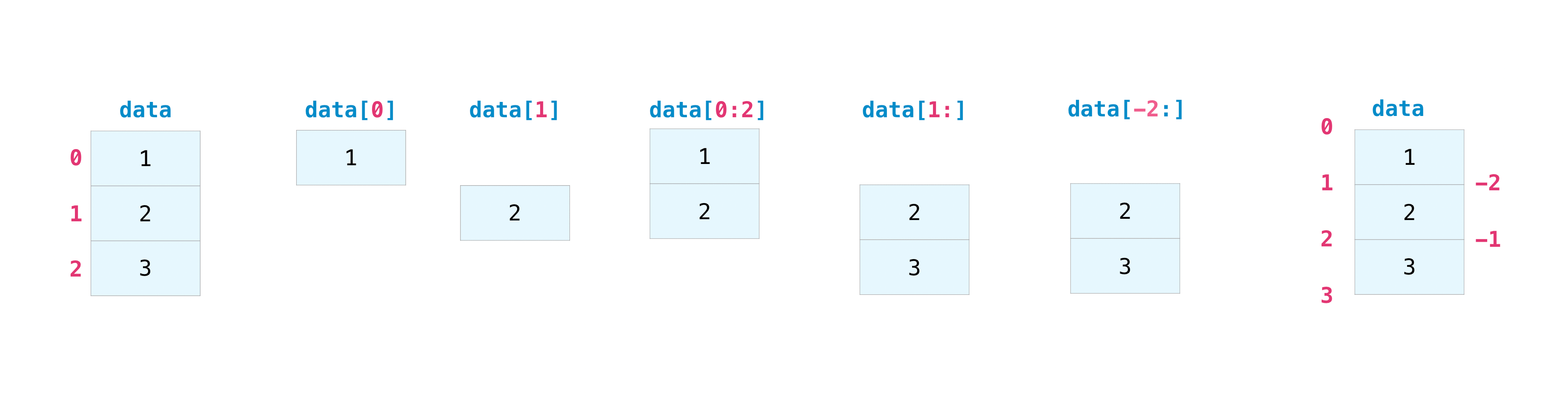
This is useful to select part of your data to use in further analysis or additional operations (subset or slice).
Slicing is useful when you know the structure of the data well (e.g. take the last X elements of an array). Sometimes, you may want to select data based on a condition (e.g. “pick data larger than X”). Fortunately, it’s straightforward with NumPy.
For example, if you start with this array:
a = np.arange(1, 15)
np.random.shuffle(a)  # Shuffle the elements for more fun
a
array([ 6, 3, 12, 7, 11, 13, 10, 14, 4, 5, 1, 8, 2, 9])
You can easily select all of the values in the array that are less or equal 5:
b = a[a <= 5]
b
array([3, 4, 5, 1, 2])
What did we just do here? Maybe its useful for you to repeat the order in which operations are realized by the interpreter:
we have an assignment operator (the
=), so we know that the right hand side is evaluated first.on the right hand side, the operations within the brackets
[]are evaluated first - we’ll get back to thisthe output of the operation
a <= 5is then used to index (access) the elements inathe output of this last step is then assigned to the variable b
Is this clear? If not, the following might help a little bit further:
le_five = a <= 5
le_five
array([False,  True, False, False, False, False, False, False,  True,
        True,  True, False,  True, False])
Exercise: what it the size, shape, and dtype of le_five? Can you explain why?
le_five can then be used to index the array a:
a[le_five]
array([3, 4, 5, 1, 2])
And this is then assigned to the variable b with:
b = a[le_five]
b
array([3, 4, 5, 1, 2])
That’s it!
Now, what do you think of the following code:
c = a[(a > 2) & (a < 11)]
c
array([ 6, 3, 7, 10, 4, 5, 8, 9])
That’s great, right?
Important! You can specify multiple conditions with the logical operators & (and) and | (or). In numpy however you HAVE to use & and | although they mean the same as and and or for python. Consider the following:
print(True | False, True or False)  # These two are equivalent with boolean scalars
print((a > 2) & (a < 11), (a > 2) and (a < 11))  # On numpy arrays, the second one will raise an error
True True
---------------------------------------------------------------------------
ValueError                                Traceback (most recent call last)
Cell In[28], line 2
      1 print(True | False, True or False)  # These two are equivalent with boolean scalars
----> 2 print((a > 2) & (a < 11), (a > 2) and (a < 11))  # On numpy arrays, the second one will raise an error

ValueError: The truth value of an array with more than one element is ambiguous. Use a.any() or a.all()
Basic array operations#
NumPy is very good at doing math!
For example, you can add two arrays together with the plus sign.
data = np.array([1, 2])
ones = np.ones(2, dtype=int)
data + ones
array([2, 3])

You can, of course, do more than just addition!
print(data - ones)
print(data * data)
print(data / data)
print(data ** data)
[0 1]
[1 4]
[1. 1.]
[1 4]
There are times when you might want to carry out an operation between an array and a single number (also called an operation between a vector and a scalar) or between arrays of two different sizes. For example, your array (we’ll call it “data”) might contain information about distance in miles but you want to convert the information to kilometers. You can perform this operation with:
data = np.array([1.0, 2.0])
data * 1.6
array([1.6, 3.2])
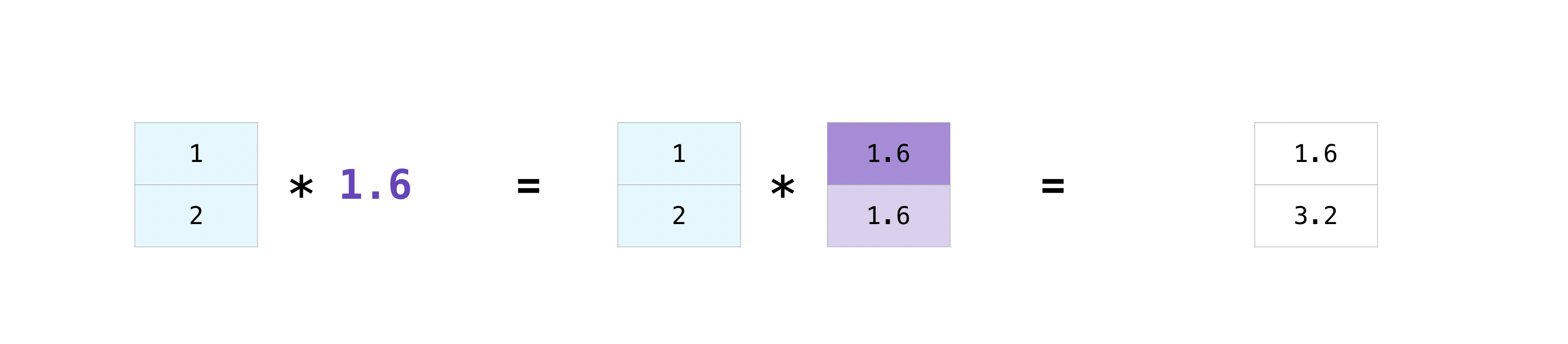
NumPy understands that the multiplication should happen with each cell. That concept is called broadcasting. Broadcasting is a mechanism that allows NumPy to perform operations on arrays of different shapes (we’ll learn about this in a later lecture).
More useful array operations#
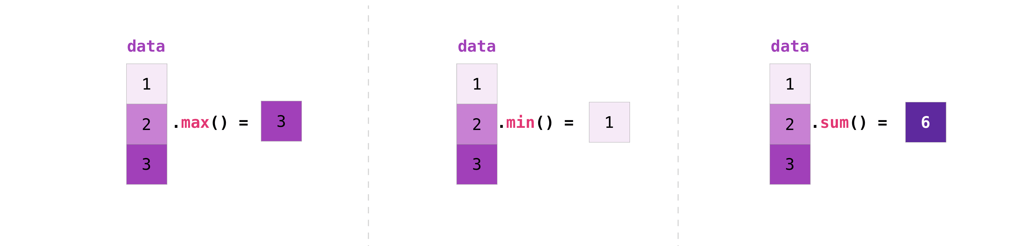
NumPy also performs aggregation functions. In addition to min, max, and sum, you can easily run mean to get the average, prod to get the result of multiplying the elements together, std to get the standard deviation, and more:
data = np.array([1.0, 2.0, 3.0])
print(data.max())
print(data.min())
print(data.sum())
3.0
1.0
6.0
Mathematical operations#
NumPy also comes with a very (very) large amount of mathematical functions that operate on arrays. Here are two examples of them:
a = np.array([0, np.pi / 2])
a
array([0. , 1.57079633])
np.sin(a)
array([0., 1.])
np.round(a)
array([0., 2.])
NumPy’s functions apply to all elements of an array, just like all other operations: element-wise.
Matplotlib#
Why matplotlib?#
Matplotlib is a comprehensive library for creating plots and graphics in python. It is used in combination with NumPy in many (many) scientific applications.
Installing matplotlib#
Make sure you have followed my instructions before going on.
How to import matplotlib#
For now, you will import the matlotlib tools we need like this:
import matplotlib.pyplot as plt
This command is only importing a subset of all matplotlib functions, but it is the most commonly used (by far).
Matplotlib is best learned by doing. Today I’ll showcase some of the tools you’ll need for the assignments, and with time you’ll learn to use many more!
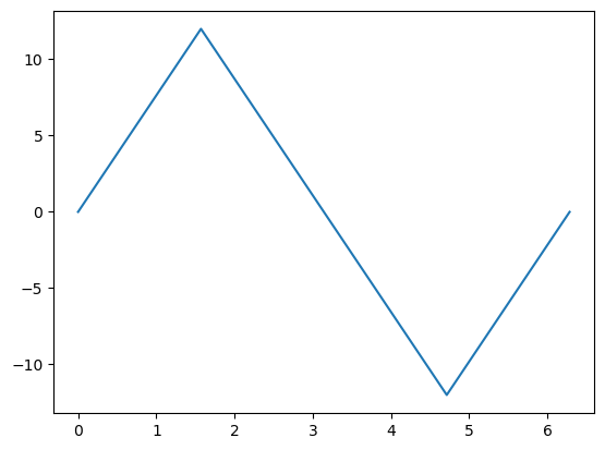
A first plot#
# This you should know by now what it does - if not, check it out above
x = np.linspace(0, 2 * np.pi, 5)
y = np.sin(x) * 12

# This is new
fig, ax = plt.subplots()
ax.plot(x, y)
plt.show()
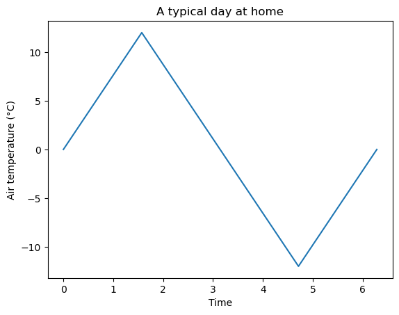
Let’s repeat this example, but with inline comments and adding some elements to the plot:
fig, ax = plt.subplots()  # Create a figure containing a single axes.
ax.plot(x, y)  # Plot some data on the axes.
ax.set_xlabel('Time')  # Add a label to the x-axis
ax.set_ylabel('Air temperature (°C)')  # Add a label to the y-axis
ax.set_title('A typical day at home')  # Add a title to the plot
plt.show()  # show the figure on screen. This is optional in Jupyter Notebooks but mandatory in scripts
Exercise: write a simple python script (not a notebook) reproducing the plot above. Run the code with and without plt.show() at the end.
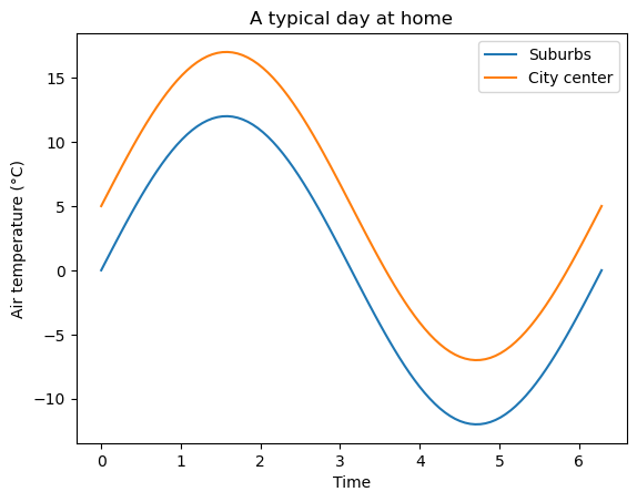
Line plots#
Line plots are probably the most common way to represent data.
# Create some data
x = np.linspace(0, 2 * np.pi, 100)
y1 = np.sin(x) * 12
y2 = y1 + 5

# Plot it
fig, ax = plt.subplots()
ax.plot(x, y1, label='Suburbs')
ax.plot(x, y2, label='City center')
ax.legend()  # Draw the legend from line labels
ax.set_xlabel('Time')
ax.set_ylabel('Air temperature (°C)')
ax.set_title('A typical day at home');
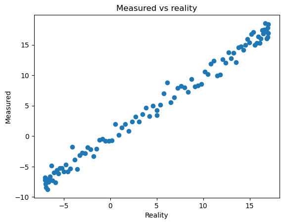
Scatter plots#
Scatter plots are used when it does not make sense to connect the data points together with lines. This happens when there is no temporal or spatial relationship between the data points, when the data is noisy or has discontinuities (for example wind direction).
Scatter plots are often used in statistics, to represent relationships between data. Here for example:
# Create random data
y3 = y2 + np.random.randn(y2.size)

# Make a scatter plot
fig, ax = plt.subplots()
ax.scatter(y2, y3)
ax.set_xlabel('Reality')
ax.set_ylabel('Measured')
ax.set_title('Measured vs reality');
Styling plots#
You can change the style of practically everything in a plot. For now, we will focus on the most important things: figure size, lines and markers.
fig, ax = plt.subplots(figsize=(16, 9))
ax.plot(x, y1, color='navy', linestyle='--', label='Suburbs')
ax.plot(x, y2, color='crimson', linewidth=3, label='City center')
ax.plot(x, y3, marker='o', linestyle='none', color='tomato', alpha=0.5, label='City center (uncertain)')
ax.legend()
ax.set_ylim(-20, 20)
ax.set_xlabel('Time')
ax.set_ylabel('Air temperature (°C)')
ax.set_title('A typical day at home');
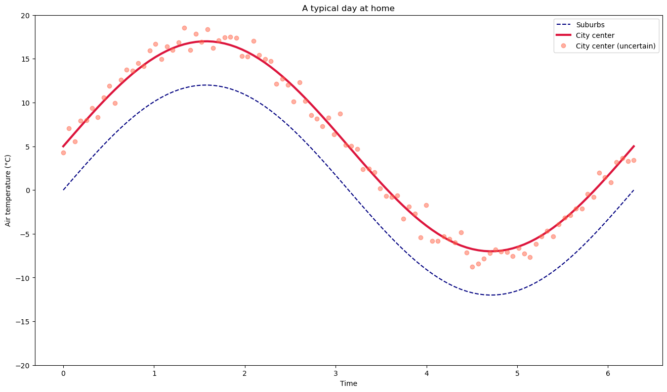
Figure size can be set when the figure is created.
Lines can be styled as “solid” (or
-), “dotted” (or..), “dashed” (or--), “dashdot” (or-.). More options are available for the adventurous. Their width can be changed with thelinewidthkeyword (accepting a float).Markers can be added to line plots (
marker=...). Their are many different ones (here is a list). In the example above, I also chose to plot only markers, no line (linestyle='none')Colors can be set in many different ways, the most common is to use named matplotlib colors
Transparency can be set with the
alpha=keyword.Axis ranges can be set with
ax.set_ylim()(orax.set_xlim()for the x axis)
The line and marker styles are then automatically applied to the legend as well.
Exercise: play around with the many options available and make experiments!
Plotting data of different units#
Sometimes, you want to plot data with very different values on the same figure. For example, plotting data of different order of magnitudes or of different units:
# Create some data
x = np.linspace(0, 2 * np.pi, 200)
y1 = np.sin(x) * 12
y2 = np.cos(x) * 0.0001  # Very different scale

fig, ax = plt.subplots()
ax.plot(x, y1)
ax.plot(x, y2);
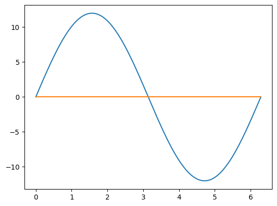
The problem is that the orange line has variations which are not visible in the graph. There are two simple solutions to this problem, explained below.
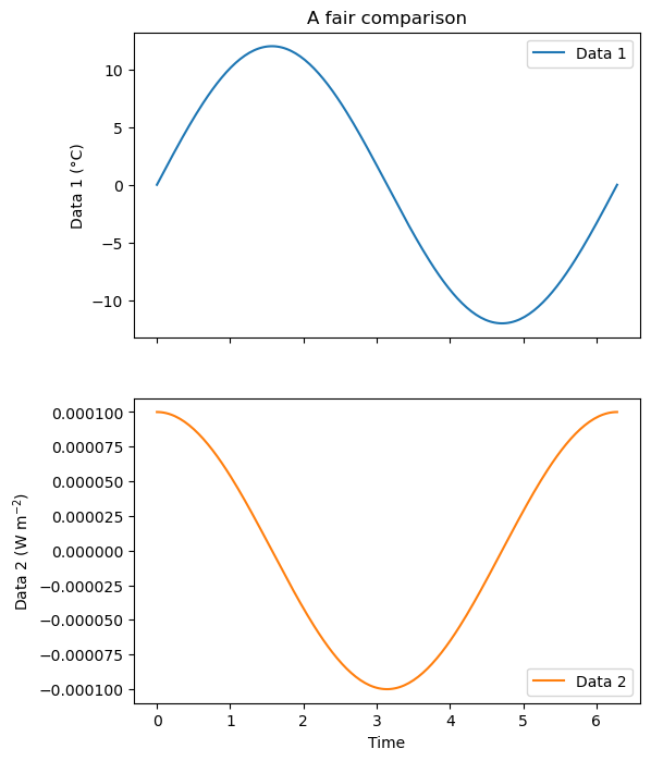
Two subplots on the same figure#
# Subplots: 2 rows one column, they share the same x-axis
fig, (ax1, ax2) = plt.subplots(2, 1, figsize=(6, 8), sharex=True)

# Plot on the first axis as usual
ax1.plot(x, y1, label='Data 1')

# Plot on the second axis
ax2.plot(x, y2, color='C1', label='Data 2');

# Add the legend for both axis
ax1.legend(loc='upper right')
ax2.legend(loc='lower right')

# Labels and titles
ax1.set_ylabel('Data 1 (°C)')
ax2.set_xlabel('Time')
ax2.set_ylabel('Data 2 (W m$^{-2}$)')
ax1.set_title('A fair comparison');
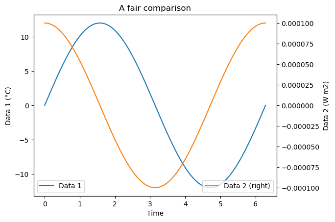
Two y-axis on the same plot#
fig, ax = plt.subplots()

# Plot on the first axis as usual
ax.plot(x, y1, label='Data 1')

# Add a twin axis to the right and plot on it
axr = ax.twinx()
axr.plot(x, y2, color='C1', label='Data 2 (right)');

# Add the legend for both axis
ax.legend(loc='lower left')
axr.legend(loc='lower right')

# Labels and titles
ax.set_xlabel('Time')
ax.set_ylabel('Data 1 (°C)')
axr.set_ylabel('Data 2 (W m${2}$)')
ax.set_title('A fair comparison');
Storing the plot as png or pdf for later#
If you are happy with a plot and want to store it on your computer for later use (in a report or a manuscript), use fig.savefig:
fig, ax = plt.subplots()

# Plot on the first axis as usual
ax.plot(x, y1, label='Data 1')

# Add a twin axis to the right and plot on it
axr = ax.twinx()
axr.plot(x, y2, color='C1', label='Data 2 (right)');

# Add the legend for both axis
ax.legend(loc='lower left')
axr.legend(loc='lower right')

# Labels and titles
ax.set_xlabel('Time')
ax.set_ylabel('Data 1 (°C)')
axr.set_ylabel('Data 2 (W m${2}$)')
ax.set_title('A fair comparison');

# Save the figure
fig.savefig('myfigure.png', dpi=150, bbox_inches='tight')
figure.savefig has several options available. The first position argument fname indicates the path to the file to write (default is is the current working folder) and its format (e.g. .png, .pdf or .eps). The other two arguments are setting the resolution the final image and whether to have margins around the figure (I often use bbox_inches='tight').
Learning checklist#
To go further#
The Basic usage documentation page is a good place to start if you are curious to learn more