Assignment 09#
Due date: 07.06.2023
This week’s assignment has to be returned in the form a jupyter notebook.
Don’t forget the instructions!
01 - Satellite image#
Download this satellite image, which is a true color image obtained with the MODIS TERRA satellite on the 04th of June 2022. If you are interested to know more about the data (and download some yourself), visit https://go.nasa.gov/2LH4Wsa.
Install the imageio library (remember how? If not, get back to the installation instructions).
Read the image as shown below:
import imageio.v3 as iio
img = iio.imread('snapshot-2022-06-04.png')
First, explore the img variable (shape, type, etc). Display it on screen with matplotlib.
# Your answer here
Now, select a small region around Innsbruck which is mostly cloud-free (approximately). Name this subset zimg and plot it (it might look more or less like this plot).
# Your answer here
The Visible Atmospherically Resistant Index (VARI) index is a simple vegetation index easily applicable to RGB images. It is computed as:
VARI = (Green - Red) / (Green + Red - Blue)
With:
Green: pixel values from the green band
Red: pixel values from the red band
Blue: pixel values from the blue band
all three scaled to the [0-1] range
Compute VARI from the zimg image. Plot it in the [0-1] range, with a colorbar added to it (example).
# Your answer here
Optional: Plot a histogram of the vari with 100 automatically selected bins (don’t forget to flatten the data first! When hist called on a 2D array it has a very different meaning).
# Your answer here
Optional: now think about a simple algorithm that could be used to detect snow and clouds in the image (disentangling between clouds and snow is still an active research field today, and it cannot be done with RGB images only). Once you have found where snow is, mask it red on the image an plot it to obtain an image similar to this one. Count the number of snow/cloud pixels in the image and its percentage coverage of the zimg image.
Tip: my algorithm is super super simple by the way - it involves summing all three color channels and a simple threshold.
# Your answer here
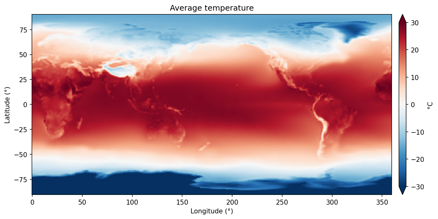
02 - Global temperature map#
Let me read some data for you:
from urllib.request import Request, urlopen
from io import BytesIO
import numpy as np

# Parse the given url
url = 'https://github.com/fmaussion/scientific_programming/raw/master/data/monthly_temp.npz'
req = urlopen(Request(url)).read()
with np.load(BytesIO(req)) as data:
    temp = data['temp']
    lon = data['lon']
    lat = data['lat']
These data represent the global average temperature obtain from gridded reanalysis data. The lon and lat variables are the coordinates of the grid.
What is the spatial resolution of the data (the distance between two grid points - or pixels)?
What is the minimum average temperature on the globe? The minimum?
Plot the data using plt.pcolormesh and the correct lon/lat coordinates, with a colorbar in the range [-30°C, +30°C] and the RdBu colorscale (example).
Now plot the zonal average of temperature as a line plot (example) (the zonal average is the average over all longitudes). Repeat with the zonal standard deviation.
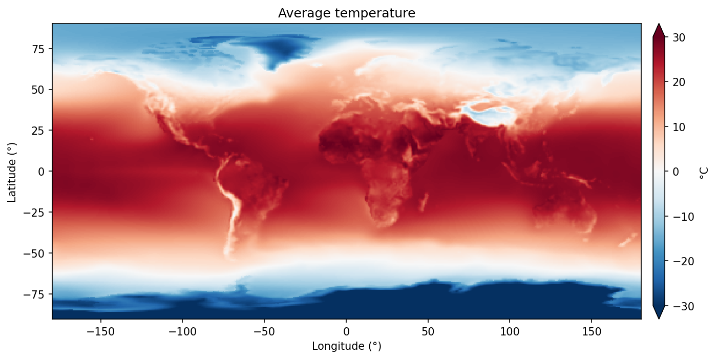
Optional: the data is great, but not well processed: the longitudes are ranging from 0 to 360°, thus cutting UK and Africa in half! Reorganize the data and the corresponding coordinate to obtain a plot similar to this one.
# Your answer here